When you run into a 404 error page, it’s always some kind of distress. If you’ve got a website and your potential customer isn’t able to find the right page they are looking for, your task is to leverage the frustration and lead your visitor to the right page not to lose their interest.
Why does a user come across the error pages? Some of the reasons for this are as follows: a mistyped or misspelled word, some spare symbols in the URL, spaces between the letters and symbols in the URL, and more. If the page has been removed from the website or a permalink has been changed, a user will also run into a 404 error page.
The following hand-picked collection refers to the most creative and weird error page designs that help to reduce the distress of a user and help to make them smile as well as have some fun. Isn’t your 404-page creative yet? It’s time to think about its uncommon design.
Vexels
A funny error page from the graphics stock. A banana with big lips just slips on a rag doll and falls down.
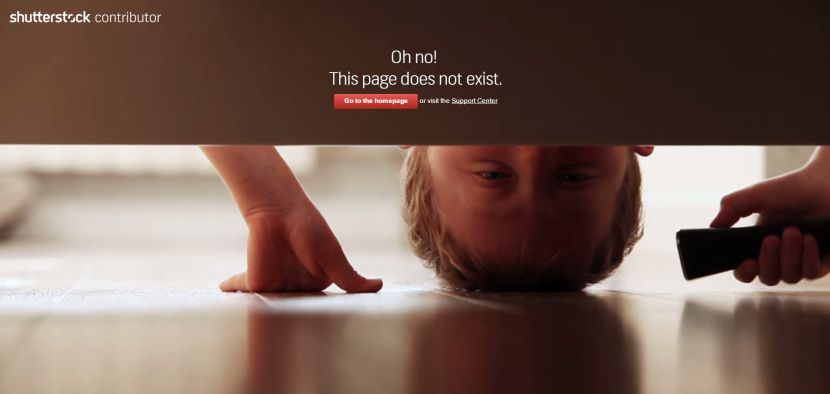
Shutterstock
A weird 404 page from a Shutterstock Contributor. A boy with a flashlight looks under his bed to look for something there.
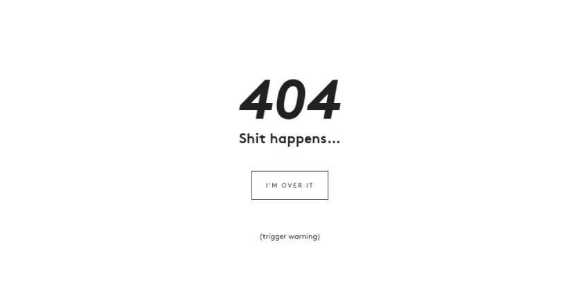
Neverbland
This clean and white page says that sh*t happens. You can be over it, however!
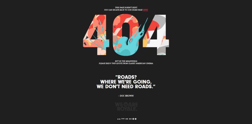
We Are Royale
An error page on this website says they don’t need roads there where they are going.
Epic
A digital agency shows its own way of creating error pages. People here look perplexed and puzzled but not confused. They’ve got something better for the lost.
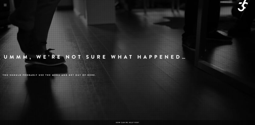
36 Creative
This creative agency shows a stylish way of announcing a wrong path. A black-and-white short movie is displayed on their error page.
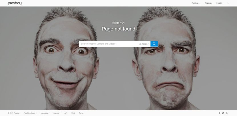
Pixabay
A man with a weird face and emotions is kind of disappointed you took the wrong way. However, you are welcome to go on with the right one.
I Plan Websites
Just scroll down to see a sheep showing you the correct path. You are sure to find what you were looking for.
North2
A small studio shows the right way with a finger. You can just go to the homepage or choose one of the menus.
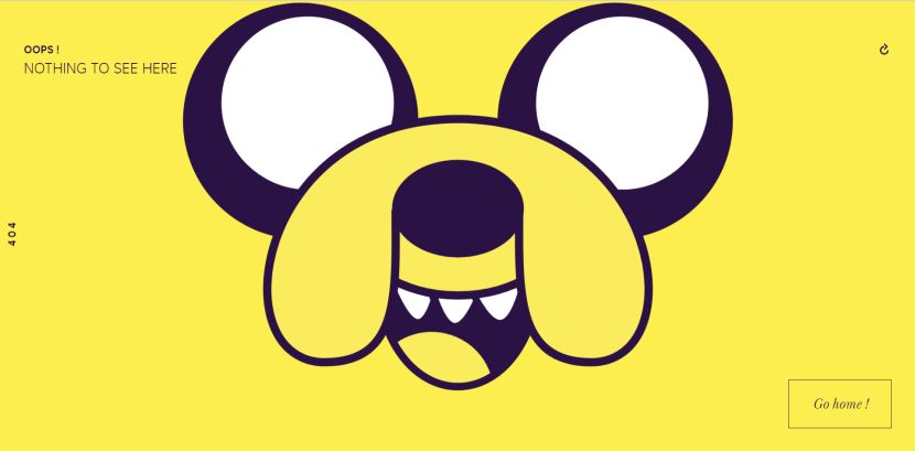
X-Prime
Every time you take the wrong way and you appear to be 404’d, a new funny animated face smiles at you telling you there is nothing to see there. Just go home!
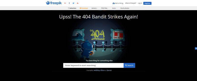
Freepik
The 404 bandit strikes you on a freepik’s error page. However, you can search for something else on a website.
Flaticon
To stay calm and not to freak out – this is great advice from flaticon. So if you’ve come across their error page you’ll be directed to the right one very shortly.
StockSnap
A robot has torn off his arm on this 404 error page. It seems like he is disappointed but you can easily correct this mistake. Just find the right page through a search field.
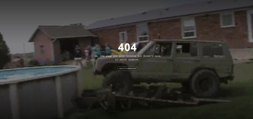
Unsplash
A photo stock offers to watch short videos with various fails on their 404 page. There you will see the sprinters falling down right before the finish, a car running into a swimming pool full of water, a funny panda, and much more.
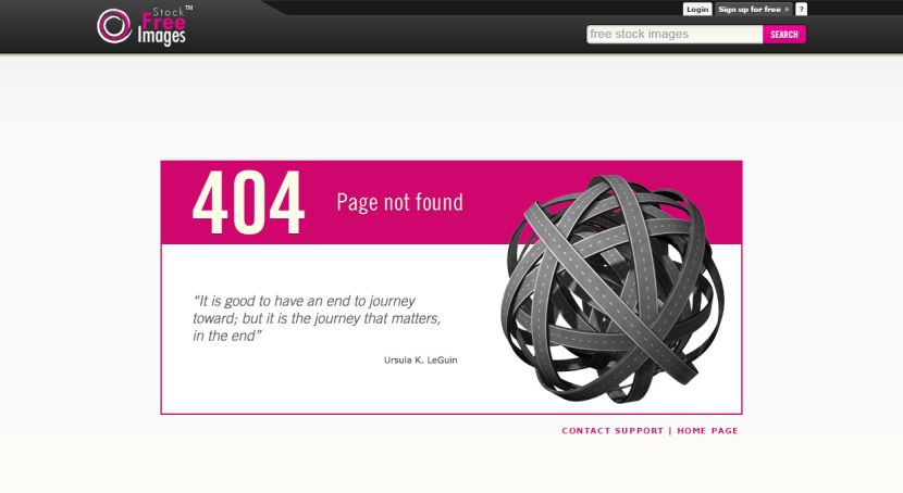
Stock Free Images
Wise quotations by Henry Miller, Ursula K.LeGuin, and other famous people are displayed on this stock’s error page. An abstract ball made of roads is also depicted. It’s up to you what signs you want to see here.
Whiteboard
The whiteboard owners suppose you’ve been looking for one of the whiteboards on their website. But they’d rather direct you to one of their web pages.
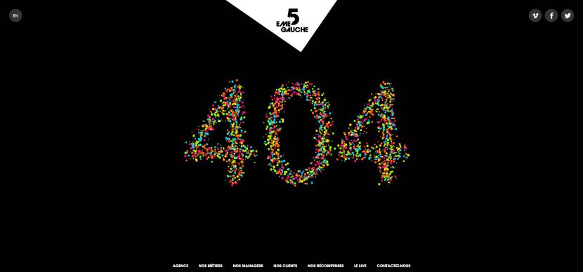
5 Eme Gauche
The 404 page of this website includes a 404 figure made of colorful animated air balloons on a black unicolored background.
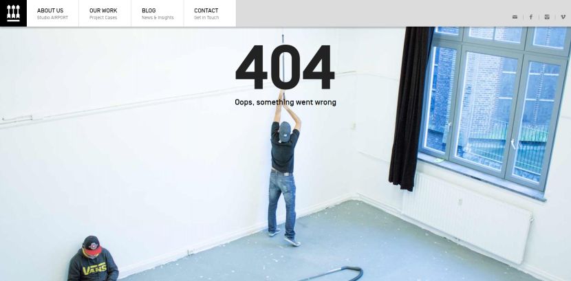
Studio Airport
The repairmen are painting the white wall, nothing else can be found here. Just pass by and look for a better page on this website :).
Captain Dash
Error or errour? Or maybe erreur? This word is misspelled here and this is a hint that you’ve probably misspelled the page name and you’ve been 404’d.
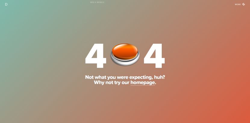
Dynamit
A 404 error page on this website is made of a zero-button, but there’s no need to push it, ‘cause there is nothing to look for in the dead end. Just go back to the homepage and start your journey again.
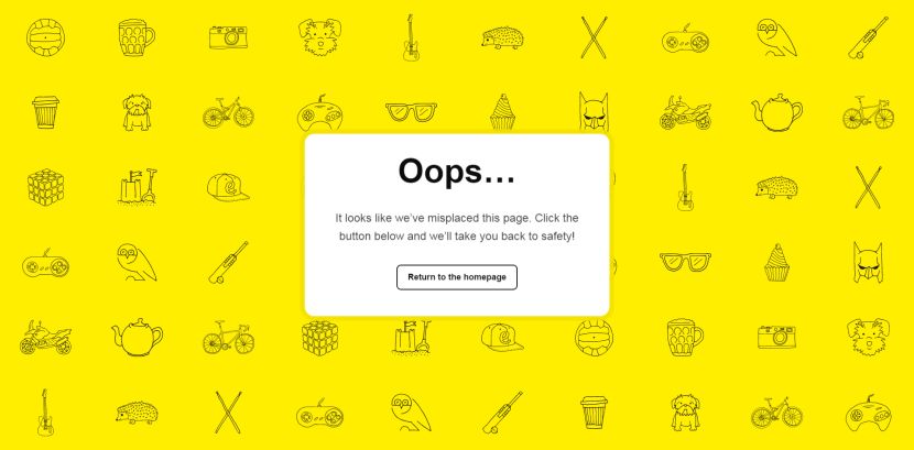
Engage Interactive
A jolly bright yellow background with small icons is complemented by a message promising to take you back to safety. Trust it and be happy!
Have you got any other ideas on making a creative error page? Or maybe you want to share some of them. Feel free to drop a line in the comments.
