If you create a website design template, it’s important to make it as engaging as possible to get a customer buy it for building a website for their business. Both designers and developers are responsible for the quality of design, its simplicity and usability, so the first task of a creator is to make a design engaging, trendy and tasty.
So we’ve decided to collect a number of useful tips helpful for crafting a really eye-catching design worth to purchase.
1. Consider the Main Point

Good design is almost invisible and it focuses the attention on content. Only if the design is performed poorly, its lacks arrest the attention and disappoint a user. If we speak of developing a WordPress theme, it’s important to create a demo which will reflect the purpose of the theme, its ease of usage and its best features. No bugs should distract a user’s attention from the key points and tasks.
2. Keep it Simple

When you focus too much on visual appeal, there’s a risk you’ll forget of providing a good functionality of your theme. When creating a demo, check all of its functions and make sure it works properly. If there are any unnecessary visual effects or elements that make a demo look “weighty” or prevent it from good functioning, remove them and check the theme once more.
3. Less Saturated Colors
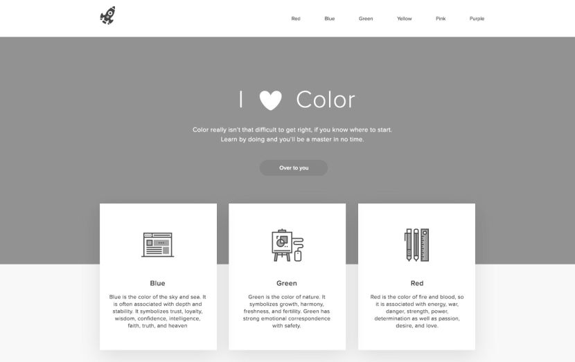
When it comes to colors, it’s important to create harmony and make them look elegant and attractive. See the examples of color combinations that other designers use for their themes, if those themes are popular and have a lot of sales. No need to copy someone’s style, just learn all possible color combinations that are widely used for designing the themes and create your own trendy one.
4. Readable Typography

Sans serif fonts are mostly used for creating website templates and constructing their demo versions. Serif typefaces have the details with terminated strokes; they add a personality to the design and make a text easy to read.
5. More Whitespace

A functional space helps to create a sense of balance, draws the eye of a user to the key aspects of design, and makes the design simpler to perceive. A lot of information stuffed into a page will make a user be confused and make them leave the page as soon as possible. Don’t overload the design with elements, and you will create a great user experience.
Those tips will be a kind of jotting for designers and developers that start to create their first website template or theme.


