
We all know that accessibility is one of the main design principles. If the design is accessible, all the needs of people with disabilities are considered, and they also can easily use any website or application. Accessible design allows to easily navigate between pages, find any necessary content, or intuitively understand the functionality of any app.
As we know, there are 4 main types of disabilities that prevent people from perceiving the surrounding environment, and they are such as visual (color-blindness or low vision), hearing (deafness or hard of hearing), motor (limited fine motor control or inability to use a mouse), cognitive (learning, memory and focus disabilities).
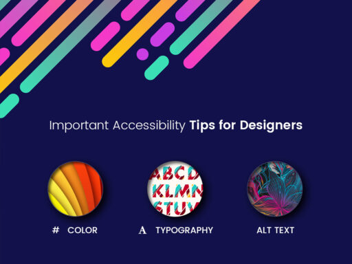
We’ve collected a few important tips concerning accessibility. They will be useful for designers and developers to help them create real user-friendliness and usability.
1. Correct Alt Attribute

Alt attribute is required when you need to define the image content in the text form. This tag should be meaningful and understandable to help people with low vision navigate through your website.
If we speak about WordPress, alt tag is generated automatically depending on the name of the image you upload. This attribute is also important for search engines to easily index the content according to definite search requests and then display the relevant results.
2. Visual Indicator of Elements

Designers often use different visual tools to convey meaning. It’s important to differentiate elements with color, shape, weight, and other visual differences that generate meaning and help to improve accessibility. There are special contrast checkers that help to understand whether the colors differ and whether they make a website or app accessible for people with disabilities.
3. Legible Typography

Fonts should be functional, and this is more important than their aesthetic attractiveness. Readability refers to the way words are arranged on the page, and legibility defines the way a typeface is designed and how well the letters are distinguished from each other in a text. Readable and legible text is more important than the font’s weight or its visual appeal.
Conclusion:
Clickable UI elements, logical layout, good color contrasts, legible text, and other aspects are important for creating accessible design. Are there any more principles we’ve forgot to mention? Don’t hesitate to speak on them in the comments. Thanks!