Being creative means not only being original and innovative but also keeping up with the times to be able to properly use hot trends to craft a real harmony, perfect quality and fresh look of your works. The end of the 2017 year is the time to predict possible design trends that are going to be on demand in 2018. So we’ve decided to review a few of them to make them clear for our readers.
1. Irregular Grids
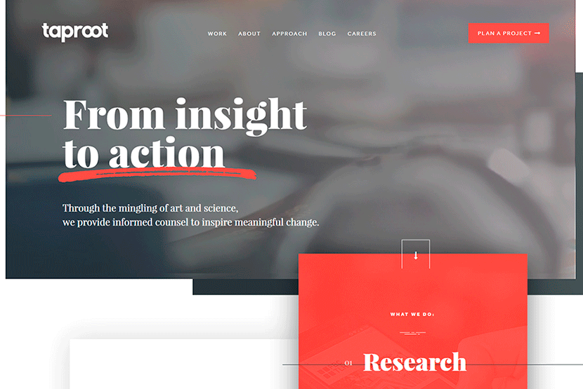
Broken and asymmetrical grid pattern now replaces perfect and straight shapes. Designers can go beyond the boundaries and make elements drift into and across the lines. This type of layout can become really engaging and catch an eye of users.
2. Focus on Photos and Illustration
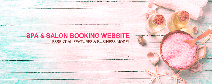
Every website design is a kind of wrapper which makes a product attractive for potential customers. No matter what you market (either a physical product in an online store, a post in a blog or a company’s services), your task is to promote that right.
Visual appeal is important aspect for marketing any product, so photorealistic images and lifestyle photos are going to take the center stage next year. Of course features and qualities of a product stay as important as always, but visual attraction should make a customer get interested in discovering the product’s advantages in detail.
3. Sticky Elements
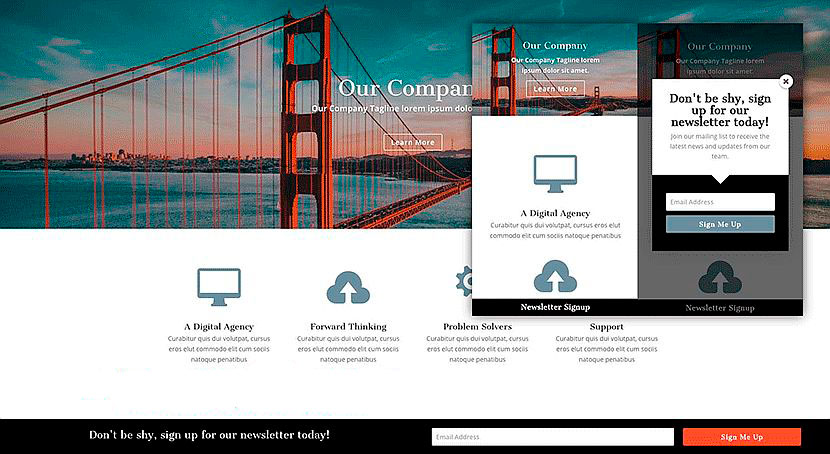
Almost every website or app with the long scroll feature includes some sticky elements which stay unmovable while scrolling. Usually such elements include chat boxes, notifications, navigational elements (like back-to-top buttons), etc. These elements stick to the bottom of a page, so they don’t irritate a user, don’t cover the important content pieces and are always accessible when they are required (or you can hide them).
This design trend is quite acceptable to stay popular next year.
4. Oblique Fluid Shapes and Color
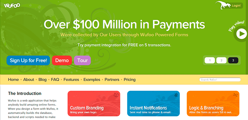
Most popular websites tend to use more rounded corners of their cards (in card design), avatars, input boxes, etc. No sharp angles are already required, they are replaced by round edges mixed with vibrant color drops, dramatic diagonals and unusual combination of tones. This is sure to bring a really striking effect.
5. Smooth Animations
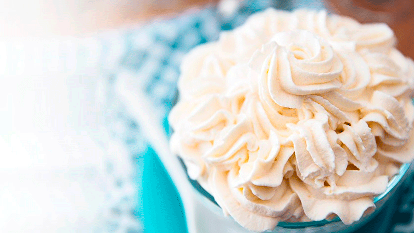
Realistic animations which show natural moves (like a slow movement in Kenburns slider) are going to become really popular. The motion won’t be forced by the click of a mouse, it will flow easily and freely. Such animation focuses a user’s attention for a longer time allowing to examine it in detail, and this is what still stays in trend.
Motion is never distracting if it is smooth and natural. A subtle animation (for instance, page transitions) can direct the visitor’s attention to the right content at the right time.
6. Maximalism Replaces Minimalism
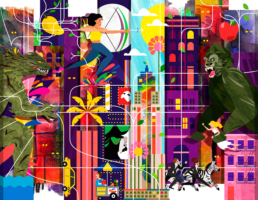
“Clean design” is the main feature and characteristics which often describes most minimal themes and templates. Less design and more focus on content – this has been a popular trend for a few last years, but today it is starting to change.
Brave colors, bold typography, contradictory motifs and patterns, repeating elements, optical illusions, and other eye striking elements can become very trendy next year.
Conclusion:
We have mentioned only several major design trends discussed by experts the most; and we consider them to be widely used by designers in 2018. There are lots of predictions concerning typography, shapes, sounds in apps, types of displaying the information, and many more aspects of design, and every professional designer or reputable blogger has their own opinion as for a certain trend. So the next year will show what predictions are true …

