Building your email list is important for creating a strong online presence and reputability. To collect emails, you create a subscription form that encourages your website visitors to leave their emails and then regularly get newsletters with your updates.
Sometimes blog- and other website owners create irritating popups that cover the main content and prevent browsing the pages. They disturb users and annoy them, so they leave the page as soon as possible.
Some other modest bloggers just place a subscription form on a certain page and wait until a visitor resolves to leave an email by themselves, without any encouragement. This method is also not really effective, because you just passively wait until a user subscribes for your email updates, and this waiting can be eternal.
We’ve decided to discuss a few efficient and polite ways to ask for emails and get subscribers without irritating them.
1. A Subscription Form On the Exit Intent
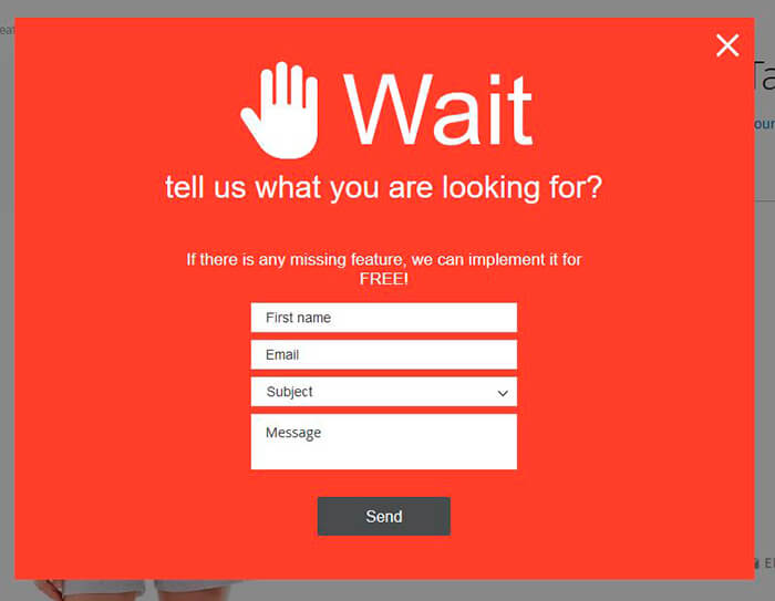
When a user is about to leave the page and makes an intent to close a browser tab, a subscription popup appears. Initially, the popup is invisible for a visitor, so they can freely examine the content, navigate through the pages and resolve whether this content is relevant for their needs, etc.
Only when a user tries to leave the page, they see the popup window offering them to subscribe. As they’ve already learned the website’s content, they can decide whether to leave the email or not. Some bloggers also offer benefits for subscriptions, for instance, a worthy freebie or a content upgrade.
2. A Popup On a Page Scroll
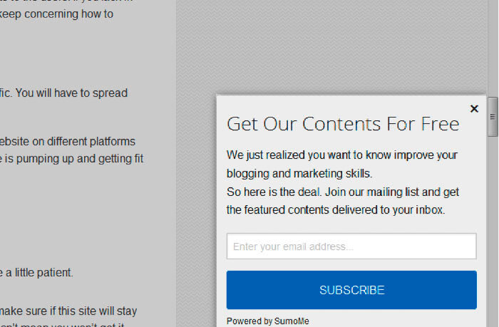
This is a polite method of asking a visitor to subscribe to newsletters. Once a user scrolls down the page, the subscription box can slide in from the bottom corner to encourage a visitor to leave an email.
It’s important just to configure a subscribe form to appear after 80% of your page scrolls. So a popup will be visible only by users that stay on your website for longer than just a few minutes or seconds. You will get the interested subscribers and you won’t disturb the ones that leave your website at once without browsing through a few of its pages.
3. A Sticky Bar At the Top
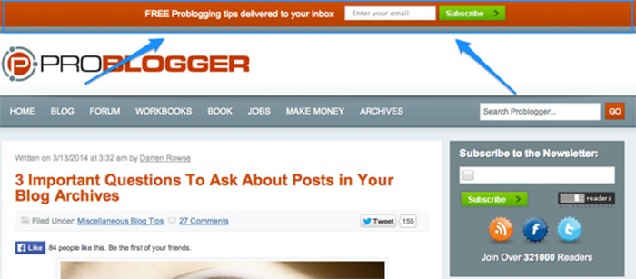
A sticky top bar is an element which scrolls with the page and remains visible for a user until they either decide to close it or subscribe. As the bar attracts the user’s attention all the time while the page is scrolled, it is considered to be an efficient way to collect emails from visitors.
4. A Dedicated Landing Page
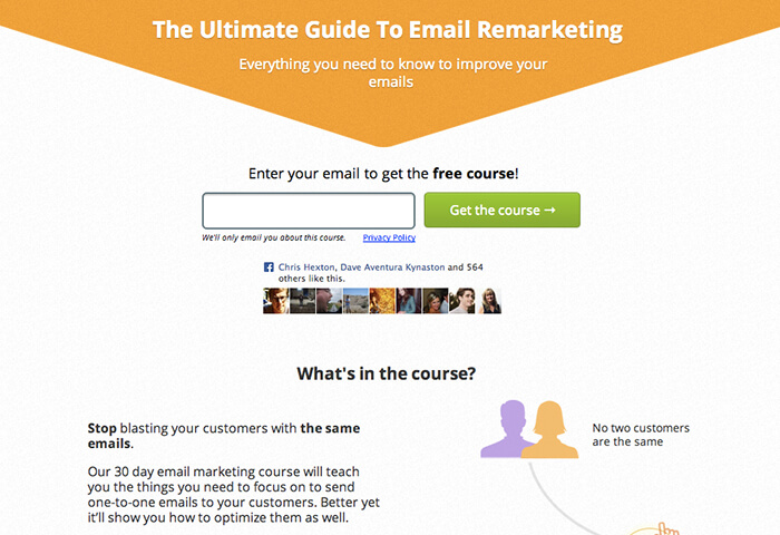
Experts say that dedicated landing pages play one of the key roles in email marketing and can significantly improve your conversion rate. The page should be appealing enough and include some special offers and benefits to engage visitors.
You can write a few reviews from different users to create a kind of social proof which gains trust. A colorful CTA button and a noticeable subscription form are also compulsory here. `
5. A Form In the Sidebar
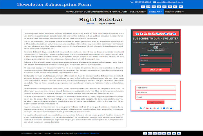
A sidebar is a good place to include a subscription form. The sidebar is visible on any page of the website and it helps to improve navigation, so many website owners use it to place the content categories, display ads, recent posts, etc.
If you put your subscription form in the sidebar and make it engaging, it will be always visible for users without disturbing them and distracting their attention from the main content.
Conclusion:
Gentle methods of collecting emails are suitable for fresh blogs that have been just launched and haven’t got enough content to offer. However, some of them are quite appropriate for reputable and well-known blogs that need to increase their conversion rate, get more subscribers and test some new email marketing techniques. Try what works for you the best!

