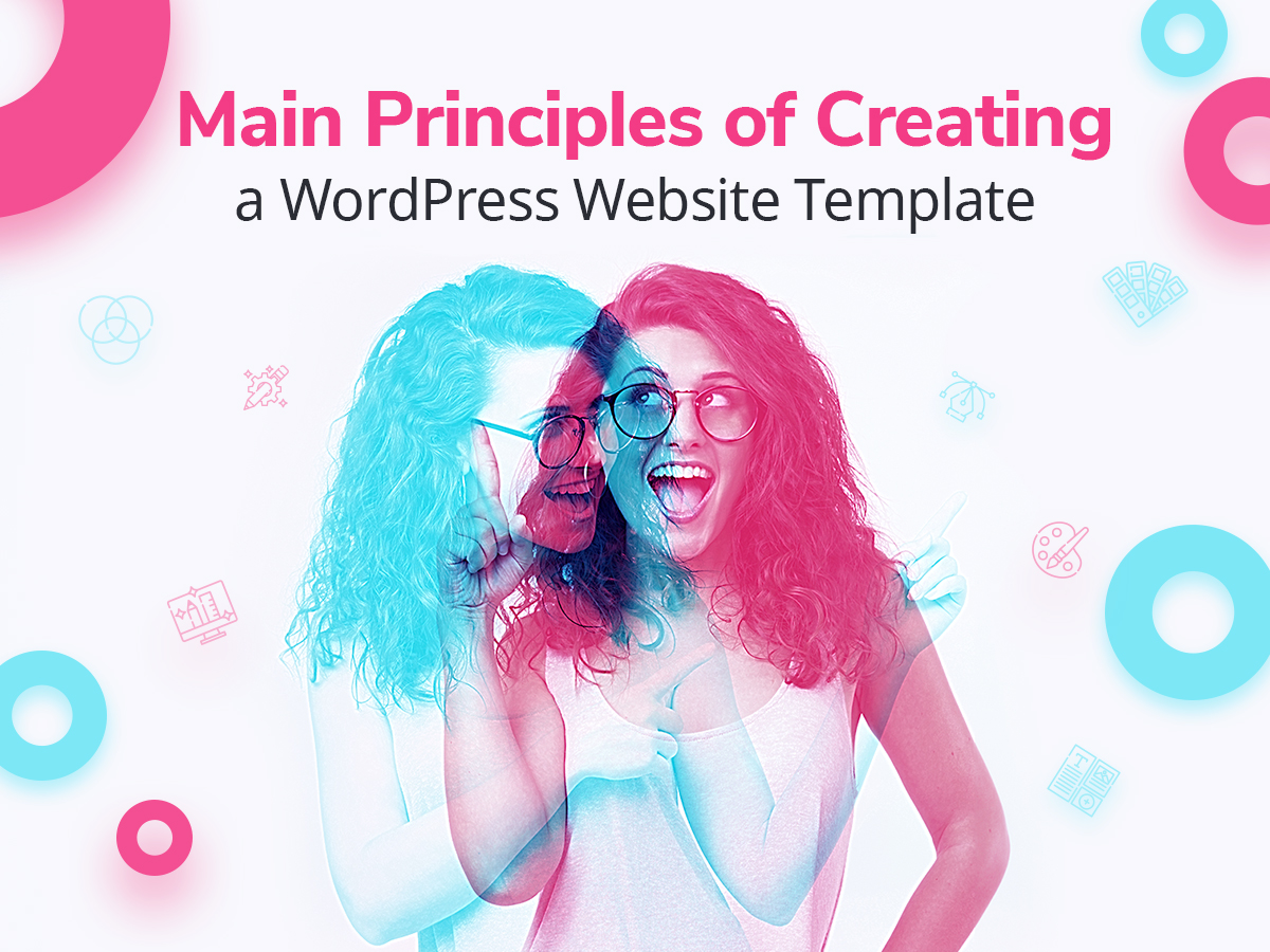
The creation of every WordPress website starts with building its design structure. Every website design should be first crafted with the help of a visual editor like Photoshop, and only after that, it is transformed into a fully functional theme with the help of code.
Creating the “foundation” for a future website requires specific principles consisting of certain indispensable components. When you look at any picture, image or visual composition, you perceive it either as the one that looks beautiful or, vice versa, the one which is unsightly and ugly. What makes a picture look either good or awful? The answer is… harmony (or its absence).
Placement of elements, combining the power of colors, perfect size, and proportions – the correct choice and combination of all of these components creates that sacred harmony which makes us say for sure we observe the beauty. But what is harmony and how to recognize it? I guess the secret is hidden in details.
The combination of details creates a complete picture and transforms into complete harmony built of small “bricks”.
In this post we will speak of visual hierarchy which includes a number of conditions defining the effective design composition. So let’s see.
1. Size, Scale and Proportion
Balance and correlation is the notion brought by nature. Everything in our life should have balance and poise, otherwise, it falls out. Size, scale, and proportion – that’s what matters when creating a website template. Let’s define who is who.
- Size is understood as the physical dimensions of a certain object.
- The scale is a relative size of different objects or the size of a single object in relation to common standards.
- Proportion can be defined as a harmony of scale.
Size is an absolute measurement, so every object on your web-page, including a header, a typeface, and the page itself has their fixed sizes.
The scale is about relative measurements, so a single object has no scale until it is observed in comparison with others. The scale is utilized across a lot of design principles, for instance, it is the way which shows a contrast between various elements or displays the similarity in the groups of elements.
As for the proportion, it is only noticed when one or more elements are out of proportion in relation to other elements, the overall format of design or the human experience.
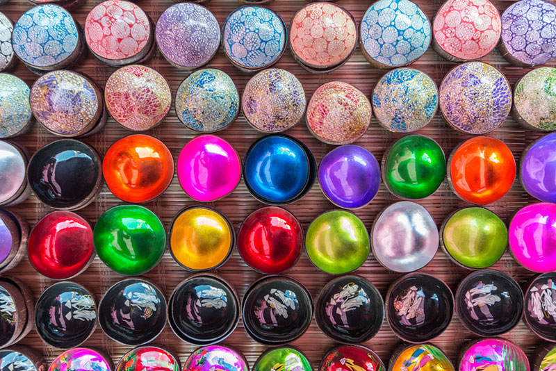
2. Color and Contrast
Design is impossible without color. If you’ve got a group of elements similar in size, the color is going to help to highlight one of those similar elements without changing its dimensions.
Color contrast helps to keep a viewer interested and allows to grab the attention of people when it is used for creating, e.g., a movie poster, an online store page, a flyer, etc.
What is color contrast, by the way? In fact, this term can be defined as the difference in luminance between two adjacent or overlaid colors which mean the foreground and the background.
Color contrast is important for the following tasks:
- make your CTA buttons stand out;
- create contrast between text and background to make the text easy to read;
- improve the accessibility of your website.
Finally, this will be pretty boring if an entire design is made out of one color or the shades from the same color family.
Take a look at this great resource providing a list of sites where you can select cool gradients for your designs.
3. Typographic Hierarchy
Every designer knows that typography should be legible and readable. The legibility means that people don’t have to make an effort to read the texts on your website.
Legibility also defines how easy it is to distinguish one letter from another, while readability supposes that text blocks and phrases on your page are easy to read.
Typographic scale creates a hierarchy in the information. This means that highlighting the separate titles or subtitles differently (in comparison to other text on a page) allows to focus the readers’ attention as well as underline their importance. Highlighting the pieces of text is made either by changing the size of letters or by using bold or italics format.
Scaling the space between lines of type creates a vertical rhythm through your text. Vertical rhythm is the spacing and arrangement of text observed by a reader as they scroll down the page. Vertical rhythm depends on such factors as line height, font size, and margin (padding).
The scale creates rhythm in typography, which, in its turn, creates intension through the text size and the space size between the text.
4. Spacing
Spacing creates a distinction between elements; this is one of the conditions which creates harmony.
White space (or negative space) is any section of the page which is unused. The space around a certain object is also defined as white space. This kind of space allows both to create the groupings of elements, emphasize the elements and improve legibility.
White space gives a place for the eye to have a rest. This rest is needed to absorb the message you’re trying to bring with the help of your design.
In design, spacing can be used to convey various meanings including quality, solitude, cleanliness, purity, spirituality, openness, and calmness. Don’t neglect spacing when creating a website template.
5. Proximity

The principle of proximity in web design means that related items should be visually grouped which creates less clutter and makes a layout more organized. If items don’t relate to each other, they should be put further apart to emphasize they are completely different.
The correct use of proximity influences the user experience and the overall success of a website. If elements are visually grouped in a correct way, it brings more effectiveness to white space.
Website’s architecture and flow of information are the foundation of effective proximity.
6. Alignment
Alignment is a key principle of your design structure. Alignment is a way of creating associations between visual elements. It provides users with the possibility to quickly understand the relations between objects on a web-page.
A number of elements is visually associated with the help of alignment. When you see several aligned elements, you believe that these elements are each other’s comparables, or they have some common property.
Alignment works on paragraphs of text, buttons, images, links, photos, or the combination of those elements. Usually, the elements on a web-page are aligned in lines or grids.
7. Rule of Odds
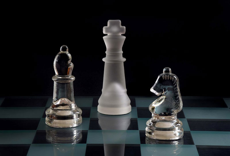
A group of elements which contains a central element with the equal number of elements on both sides of it attracts more attention of a user and allows to better focus on the central element.
If you frame the object of interest with the even number of surrounding objects it becomes more comforting to the eye. Thus, this creates a feeling of ease and pleasure for a user.
In addition, the rule of odds suggests that the odd number of subjects on an image is more interesting for a user than the even amount of them.
8. Rule of Thirds
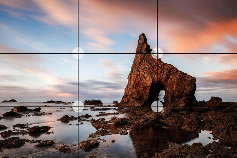
Designers use this rule to improve the overall balance of their compositions. Abiding by the rule of thirds, you create a classic grid which helps you to find out where it is better to place your design elements.
In other words, you should divide your canvas into three equally sized horizontal and the same sized vertical sections to create a kind of roadmap helpful for resolving where to place some objects.
Three vertical and three horizontal lines create 9 different sections, so you can conceptually divide your page into such sections to create more effective design composition.
9. Repetition
The repetition in web design creates a unity which increases the recognition and understanding of your design. Repetition means that you reuse the same elements throughout your design. Menu items, logo, and some other elements on a web page are repeated on every new page and appear in the same place – this is the example of repetition.
Viewing the consistent elements makes a user feel more comfortable and improves the user experience. Repetition should be used to keep an eye familiar with the design’s elements, so if you repeat the shapes, fonts, colors, textures, or other elements on your page, this creates a consistency which defines a perfect design.
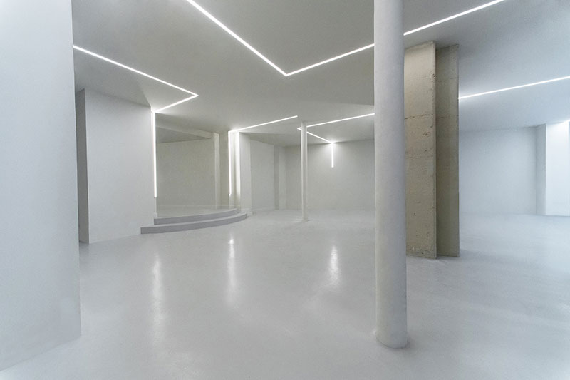
10. Leading Lines

Leading lines refer to a method of design where the attention of a viewer is drawn to lines that lead to the main subject of an image. A leading line helps the eye to follow through different elements of design.
Normally the lines start at the bottom of the frame and guide the eye of a viewer upwards and inwards; from the foreground to the background, and towards the main subject of a composition.
Such lines give a feeling of motion, they can point so far inwards that they reach the place where a few of them converge into theoretical infinity.
11. Perspective
Perspective helps the designers create an illusion of depth, from several inches to several miles. Some special cues prove us that certain objects are located closer than other ones, so we can put up a three-dimensional picture of our environment.
Larger objects are perceived as the closer ones, so they attract more attention than the smaller ones which are perceived as those that are located further.
Final Thoughts:
Well, if you are about to create a great website design, all of the mentioned above rules are worth to follow. You can also look through this comprehensive collection of best resources for designers we’ve hand-picked especially for you. Here you’ll find the awesome sites to download free stock images, videos, vectors, fonts, textures, and much more. Good luck!