Simplicity is always appreciated especially when it comes to website design. When the site is intuitive and easy to navigate, the website owner gets more chances to have lots of visitors transformed into repeat users.
The goal of any website is to make it clear what a user should do on the page. Users should understand the end result of their visit. That is why it is quite important to make your website design as easy and clear as possible, and this is what we will talk about in this post.
1. Call to Action

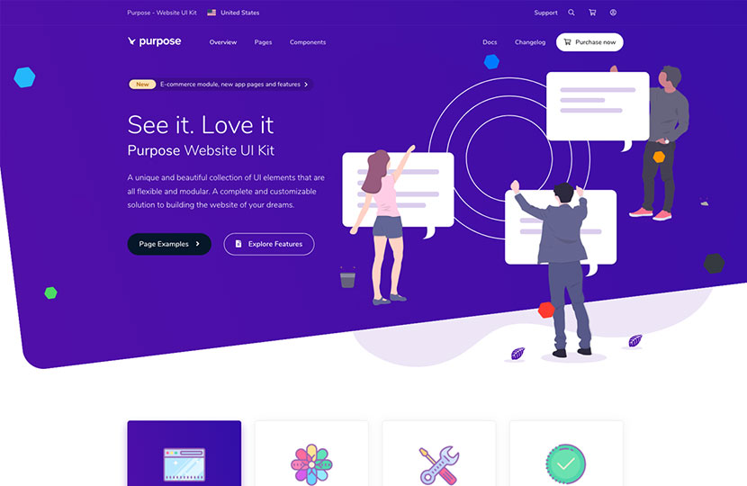
Call-to-Action is the key thing which shows a user the real aim of their visit. CTA buttons should show a user where to click to reach the end goal. Buttons would better be clear and big enough to be noticeable by users. In addition, they should lead to the right pages not to lead a visitor too far from the end goal.
2. Limit Not to Overwhelm
Related posts and inbound links which connect the related content create flow and simplicity of reading and perceiving your website. No need to overwhelm a user by building too many pages with much information which is hard to learn during a short period of time.
If you’ve got pages with outdated content, try to update and republish it to keep your website up-to-date and current for your new visitors.
3. Less Colors – Better Look
Sometimes minimal design including one or two colors can look even more beautiful and attractive than colorful website which confuses users and makes the design overwhelming. It’s important to choose a trendy but pleasant looking color palette consisting of two or three colors which are easy to perceive and which don’t distract the attention from the main content.
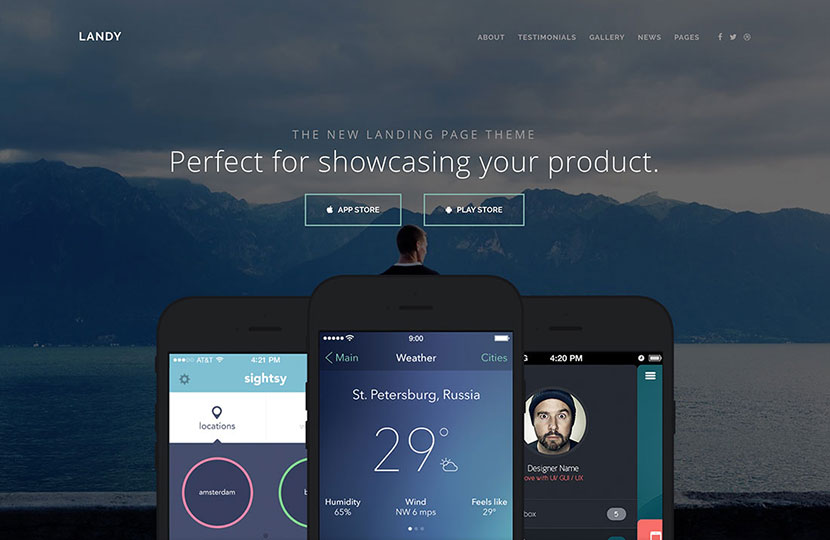
4. Standard is Easy
If you strive for ease of use, then opt for standard navigation instead of alternative or hidden one. Top, side or pop out navigation menu is habitual and intuitive for lots of users who have visited thousands of websites.
If the navigation is cluttered or unclear and a user is puzzled about how to find one or another article or element on the page, this is going to be the wrong way for your website.
5. Law of the Virtual Few

There is a principle which states that top 20 percent of content should be changed to make 80 percent of overall changes if you redesign a website or update its look. Only 20 percent of all your website elements influence the other 80 percent of anticipated user actions. A great deal of user interactions is caused by a small bunch of elements of your website.
6. UI for a Purpose
All icons, images and other elements you use on your website should be there for a reason and not in vain. If the icon or element is located in your header, footer or sidebar, it should be clickable and it should have a definite purpose (for instance it should open a social media page to share a piece of content, trigger a popup, etc.).
No need to overwhelm users with user interface elements if they don’t have a certain purpose.
7. Use of Typography
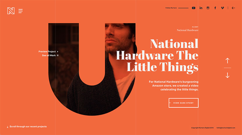
All experts always advise to use only two typefaces for your site – one for the website text and another one – for display needs.
If you select simple and standard fonts, they are easier to read, they have legible shapes, widths and heft that are readable and easily perceivable. Your typography should have contrast with your website background, and this is also an important rule.
8. Bigger Lettering
Big size of lettering is always easier to read, especially on a large screen. There’s no need to put as many text as possible above the scroll, ‘cause it should be big enough to encourage users to scroll and learn more, browse the pages of your website to stay for longer and then become your repeat users.
Mobile users are especially got used to scroll any page to learn more, so even if there is not enough information above the scroll, they are intuitively going to scroll. Don’t be afraid to make your homepage text bigger even if only the first word will be visible on the mobile screen above the scroll.
9. Clear Message
Use a tone of message that will engage a user and flow through the design with harmony. Use a language that will make a user understand what you are and what they get, make your welcome message readable and understandable.
Be sure your every word corresponds with visuals you use on your homepage, your website is a form of communication with a user, so make this communication positive.
10. A Single Uncommon Thing
Following the standards and rules is good but there always should be something unusual and original which can attract the attention of target users and help your website stand out from the rest. Create visual appeal and interest with a single element which is noticeable and different from the overall design.
Conclusion:
Consider the end goal you want your user to reach on your website no matter it is buying a product, downloading an app or filling out a contact form, and then create your design and call-to-action depending on that aim.
Follow the rules of simplicity but be always original and unique. Good luck!