
If you look at your website’s statistics, you’ll find out that more than half of your users visit your website from their mobile devices. Most of the modern users prefer tablets and mobile phones to browse websites and they do it even more often than from desktops.
When you create your mobile app or test your responsive design on mobile devices, it’s important to check out if you’ve made your mobile version shine and provide your visitors with unforgettably pleasant user experience.
The following tricks will help you make your UX beloved by your target users and potential customers.
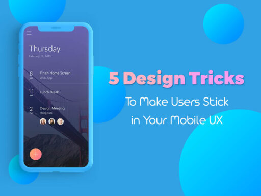
1. Quick and Organized Navigation
Multi-level navigation menus are already out of date. When a user enters your website they want to find what they need in the shortest possible time. Consider your analytics to find out what pages your visitors are looking for at the very first time they attend your website. And then make those pages visible in your navigation menu right from the start.
Your users should be able to find anything they want within a few seconds. By the way, the less space is covered by the menu, the more room is available for placing other elements and making your design easier to perceive.
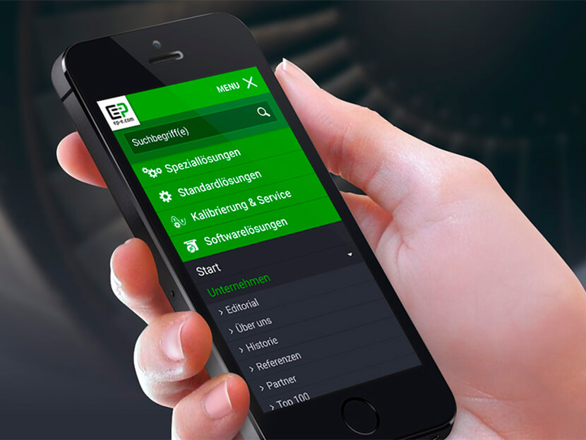
2. Touch is a Key
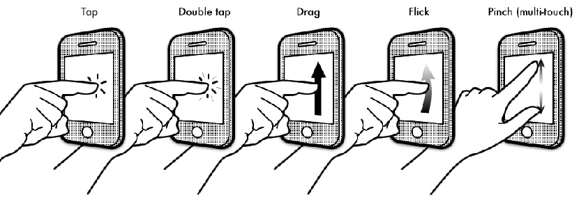
Of course mobile users interact with their devices differently than desktop ones do. If desktop users utilize a mouse, then mobile ones usually touch the screen with their fingers. So if a desktop website version is created to be easy to click than a mobile one should be easy to tap.
The size and form of your design elements should be crafted considering that users will:
- tap and double tap;
- scroll the page;
- press and hold;
- drag and drop;
- zoom in and out;
- swipe and flick.
Interactions shouldn’t be obtrusive, they should bring only positive experience and no to irritate. Of course this should make people return to you site or app again and again.
3. Make it Like a Dialog
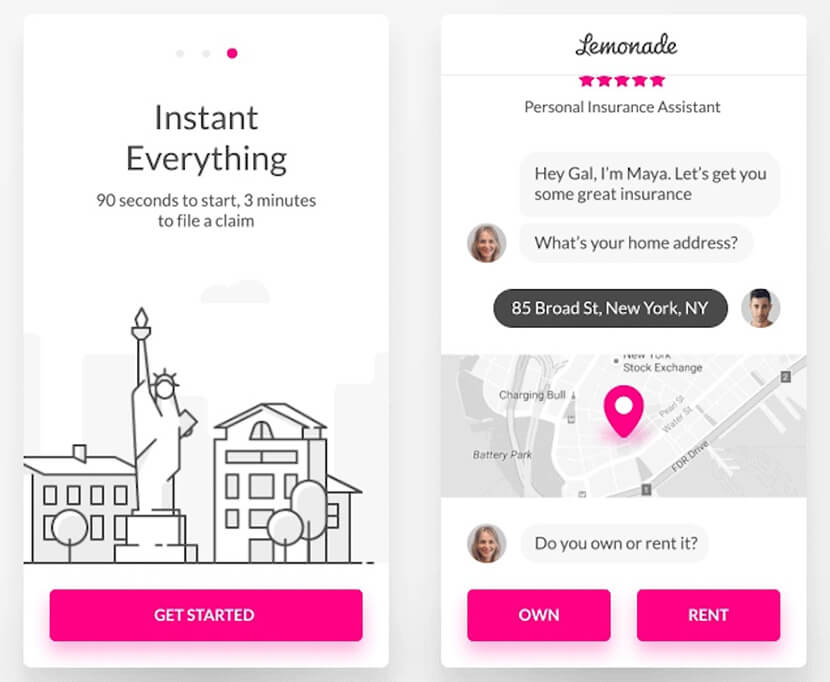
It’s a well-known fact that mobile design should include as much interactions as possible to be attractive for users. It’s important to create a kind of communication between a person and an app. So every time a user clicks an ok or cancel button, clicks yes or no when answering some questions of chatbots or carries out any other action on your website or in your app, they run a conversation which captivates their attention for longer.
- When creating a tone of language of your design, use phrases that people usually prefer for a simple conversation, write as they speak.
- Use messaging features and create instant interactions.
- If your app allows, integrate a voice interface into your design.
4. Animations Rule
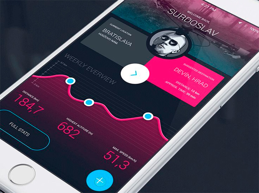
It’s great to use animations in your mobile apps, but it’s better to avoid any parallax or hover effects that can make your design slower. Animation makes design elements really engaging and brings life to your design. By the way, animated elements help to better interact with the design.
For instance you can create animations for loading, transition, navigation, visualization of an action result, etc.
5. Proper Forms
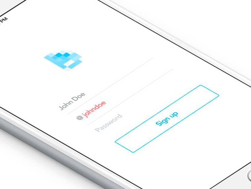
Forms shouldn’t include a lot of fields. If this is a sign up form, you can ask for a name, email and password, and remove all spare fields that can make a form complicated. Refuse from auto complete functions when filling the forms, this will help users avoid misspelling when they type an email address or put in any personal data.
A good feature is a social login form. This will allow a user login with one click just choosing the definite Social Media button. This will of course ease the process of login and reduce the amount of possible mistakes that people sometimes make when filling out a sign up form.
Conclusion
Mobile user experience is something that directly influences your traffic and conversion. More satisfied website visitors bring you better traffic and popularity. Good interactive mobile design engages more users, and this is what you’ve made your website or app for.