There are many ways to represent data especially when it comes to design projects. Design is the information represented in visual form, so if you create something like infographics, timelines, maps, illustrations, and so on – this is the visual representation of words and expressions you want to say.
Diagrams and graphs represent the information like the annual earnings, weather changes, etc., maps display the look of the streets and location of different objects; timelines allow to show the chronological stories feed using dates and small description of every event in a visual manner.
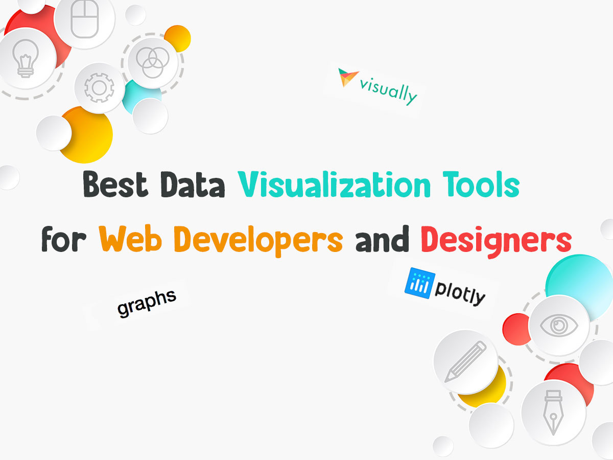
We’ve collected a number of resources which purpose is to visualize data using different kinds of visual elements. Let’s review them.
1. Plotly
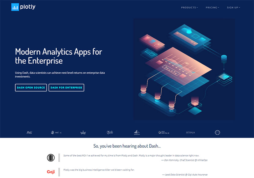
This is a modern service which allows to represent any data by creating charts and presentations as well as using dashboards. Among its products you’ll find the dash one including Python tool for analytic apps and a chart studio for creating charts.
2. Tableau
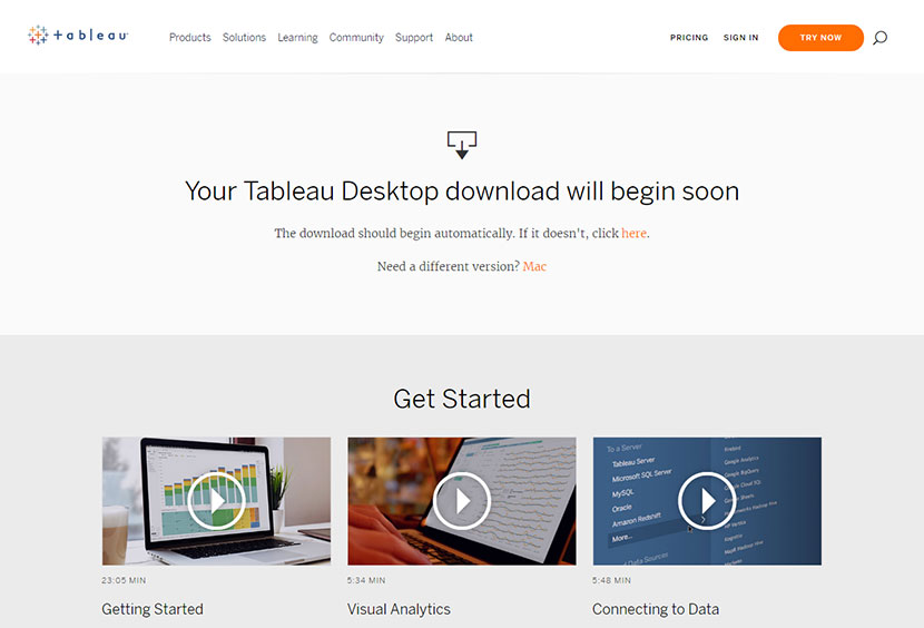
A modern tool suited both for an individual and the enterprise. It provides the ability to visualize information with graphs, maps, charts, and much more. The service is fully free and allows to make amendments using the drag-and-drop editor to see the changes in real time.
3. Visually
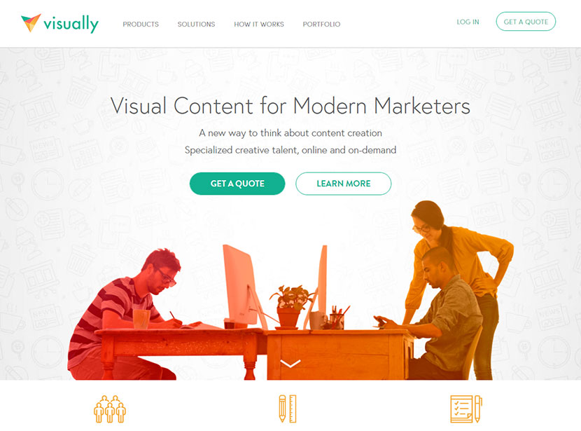
This cool tool allows to create stunning infographics, reports, presentations, slideshows, and much more types of presenting information. It makes it easy to create content in 5 steps starting with getting a quote. Go and see how helpful this platform can be.
4. Timeline
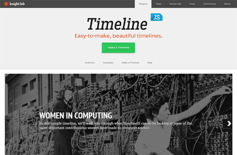
Any timeline allows to display a list of events in chronological order. This tool helps to create beautiful timelines in 4 easy steps. As a result you get a visual presentation of your company story, your personal professional development, or any other list of events which is easy to perceive.
5. Leaflet
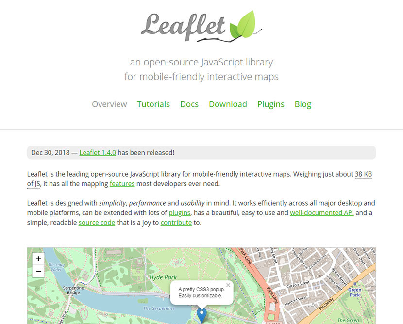
This is an open-source JS library for creating interactive and responsive maps. It comes with mapping features that most developers require. This service can be extended with plugins and has an easily readable source code you can feel free to contribute to.
6. Graph Gifs from Giphy
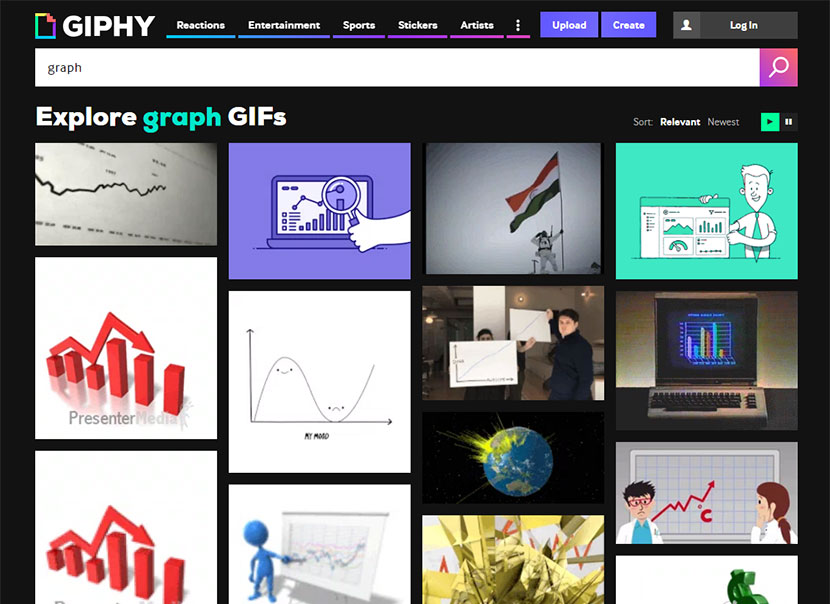
This service allows to create diagrams and flowcharts in gif format. You can select from different categories like entertainment, sports, stickers, artists, and more of them including the variants of graphs you can create to present your information.
7. Visage
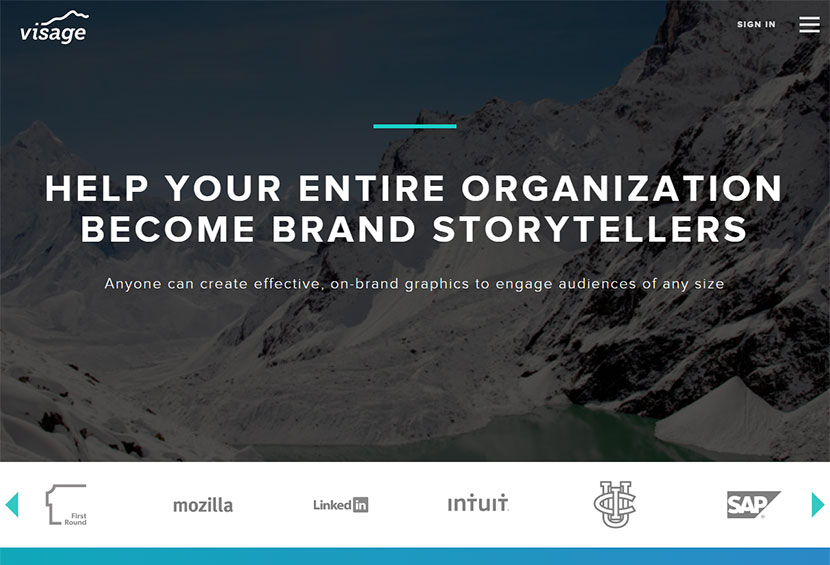
If you’ve got a large company and want to showcase a big amount of data, you can use this tool to create infographics and charts. Just tell the story of your company in a visual manner using this service which is always there to help.
8. Canva

This tool is a good replacement for Photoshop. It allows to create business designs like cards, flyers, and more. It has a library of graphics and comes with drag-and-drop builder which makes the creation process very easy.
9. Infoactive
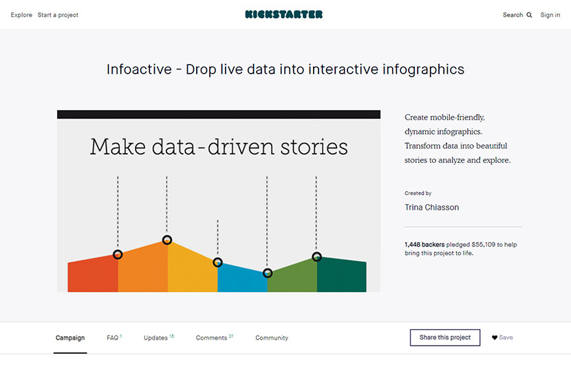
This is a project of a Kickstarter and it helps to create beautiful infographics with mobile-friendly design. Just drop live data into interactive infographics and get the result.
10. RawGraphs
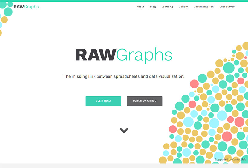
And this tool allows creating raw presentations which means making the presentations in vector format. You can save the ready files in SVG and PNG format and then edit them if required before presenting your product to the world.
What other data visualization tools you use? How exactly do you like to you represent your personal or company information? Please share.