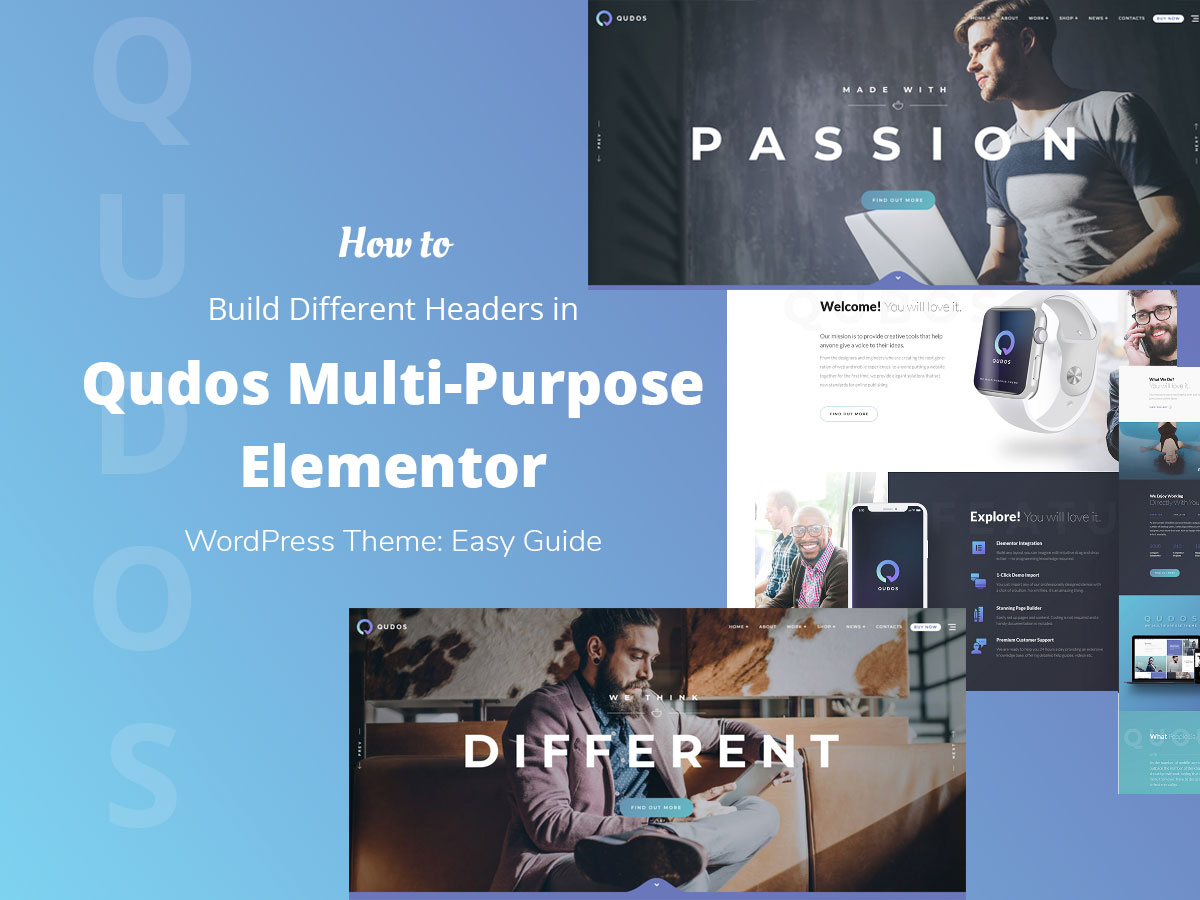
Qudos Multipurpose Elementor WordPress Theme is a new ready-made WP website design solution developed by our friends – GT3 Themes. It comes with several homepage templates, a few portfolio layouts, as well as a lot more features and built-in plugins.
You can watch this video to learn how to install the theme together with all of the plugins included in the pack and how to import the theme’s demo content.
So after you’ve installed and activated your Qudos theme as well as imported its demo content,
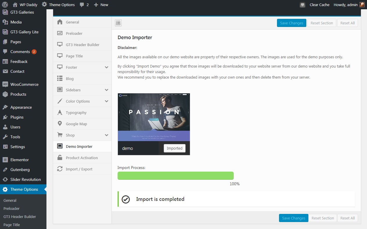
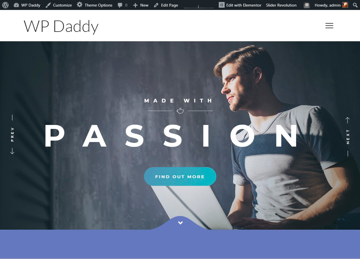
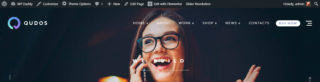
your website will look exactly as the default theme’s demo. Here’s how the theme looks with WP Daddy logo.
You will get access to the Theme Options and the GT3 Header Builder in particular.
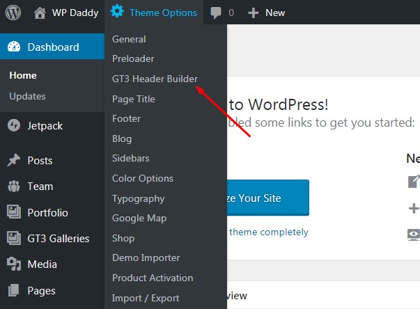
Let’s review the key possibilities of the Header Builder available for Qudos WP theme.
Note: It’s important that you have GT3 Core Elementor plugin activated to keep Theme Options accessible.
Header Presets and Header Management
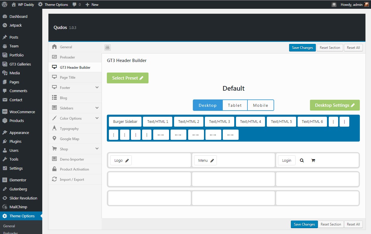
The header builder allows to edit and completely change all header content, build unlimited headers and put them on any page as well as chose any preset for your header. You can create different headers for desktop, tablet and mobile displays.
To select a preset, click the Select Preset button
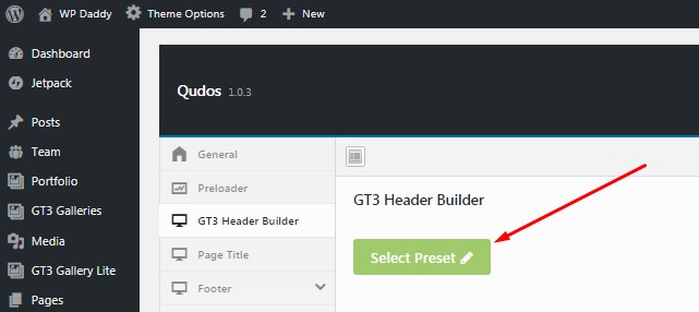
and choose any of the available templates from the list.
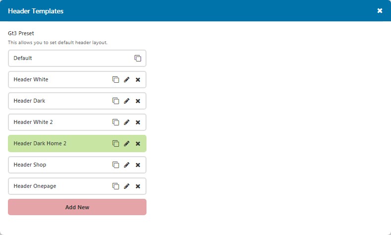
Now you can modify your chosen header preset as you require. To add or remove any header element, just drag-n-drop it from and to the panel above the builder, try different variants, and save your changes when you are done.
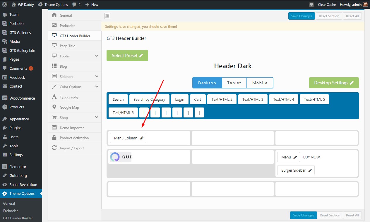
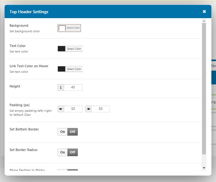
You can also manage the header settings before saving your changes.
Working with Headers
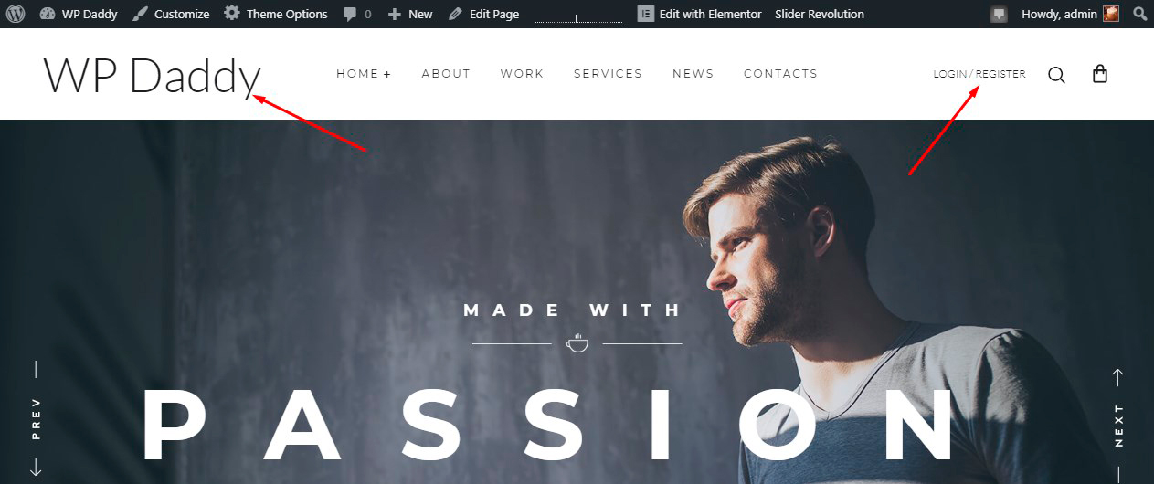
For instance, I try a dark header and put my main menu, add a logo, and a burger sidebar,
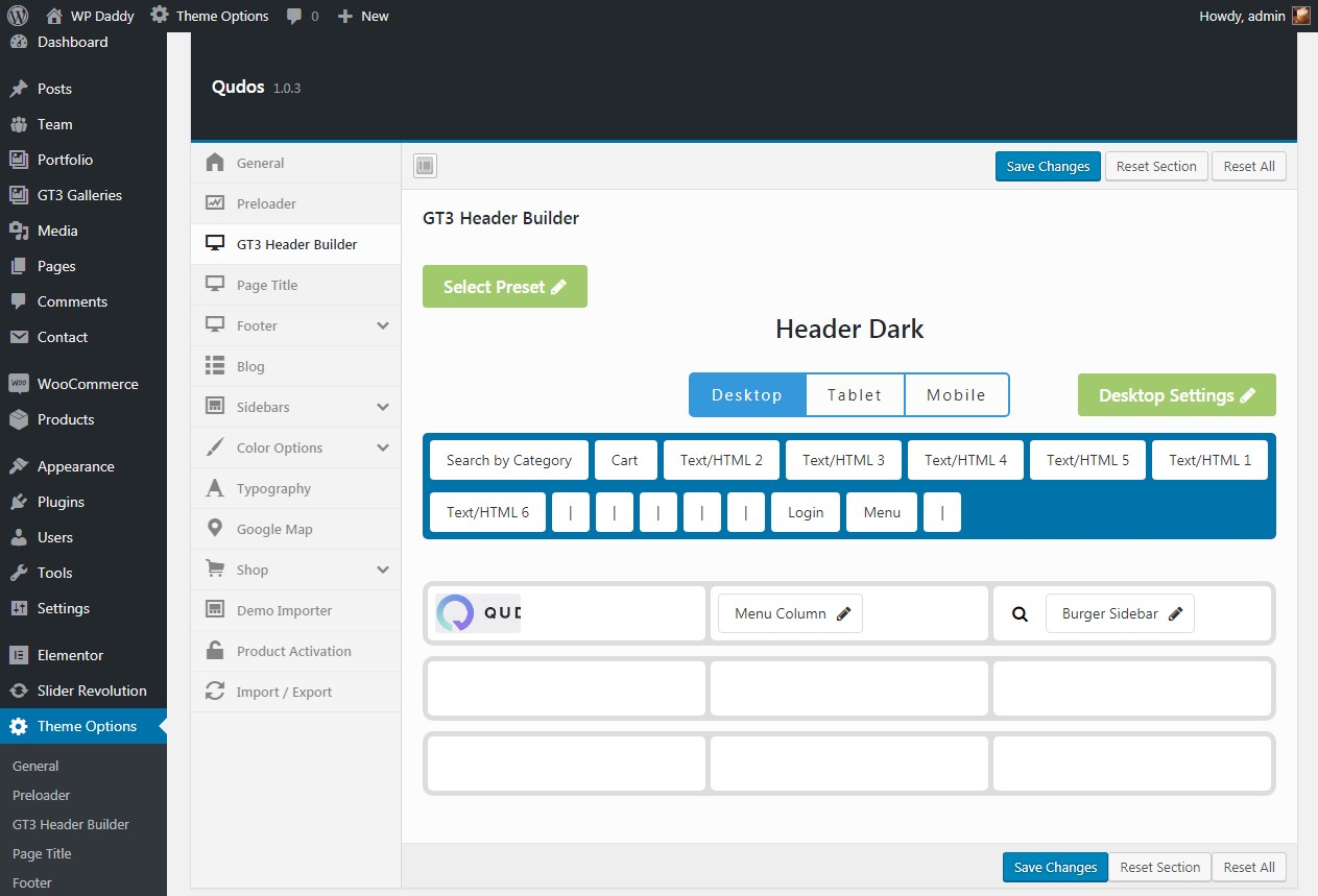
and see my header live.
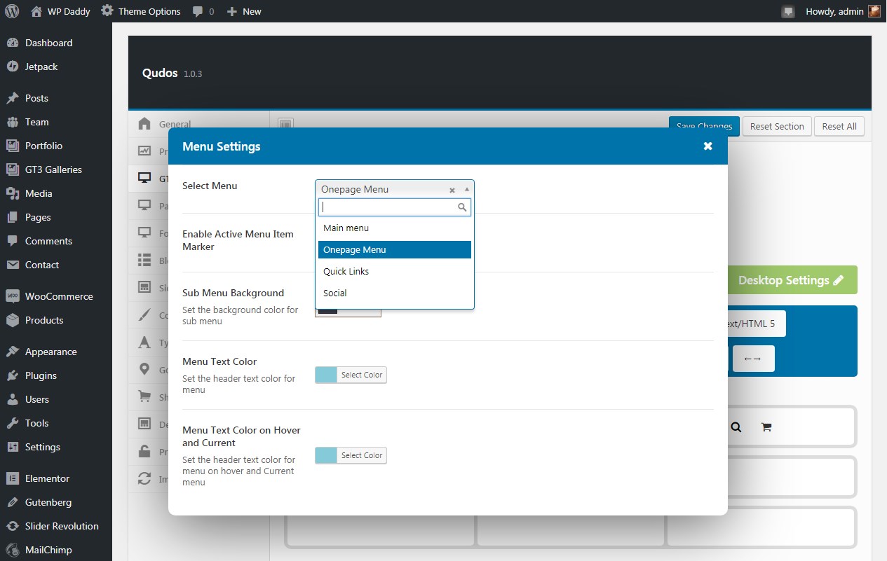
You can add much more elements like a login form, search by category, etc. It’s possible to leave the default header as it is, place your custom logo, menu (choosing it from the Menu Settings),
a search form, a cart, and some more elements you want to be visible in the header,
and then see it live to make sure all looks right as you want it to.
Try much more header template variations and see the results by your own, it’s easy.
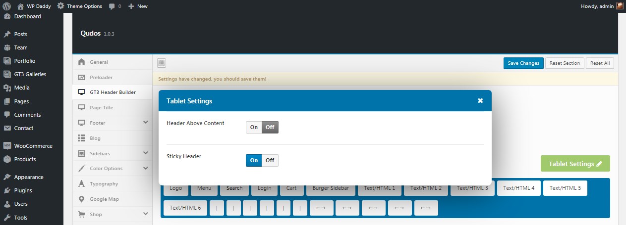
Desktop, Tablet and Mobile Settings
Both desktop, tablet and mobile header versions include their specific settings,
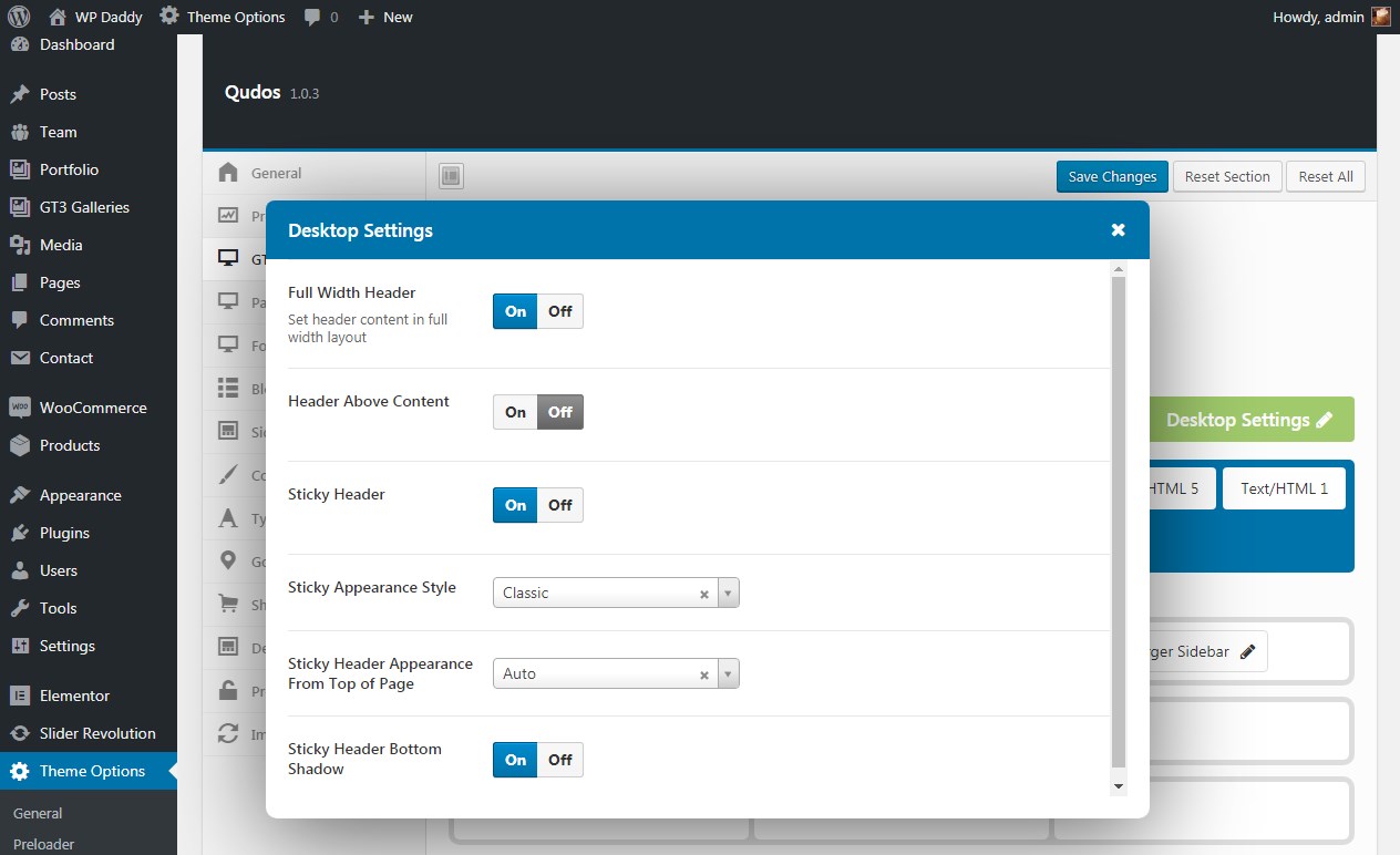
so you can either turn on or turn off the fullwidth header, the sticky header, the sticky header bottom shadow, and manage much more options.
Building headers for tablet and mobile versions of your website are as easy as for the desktop one. Try it yourself!
Hope this was helpful.
Melany H.