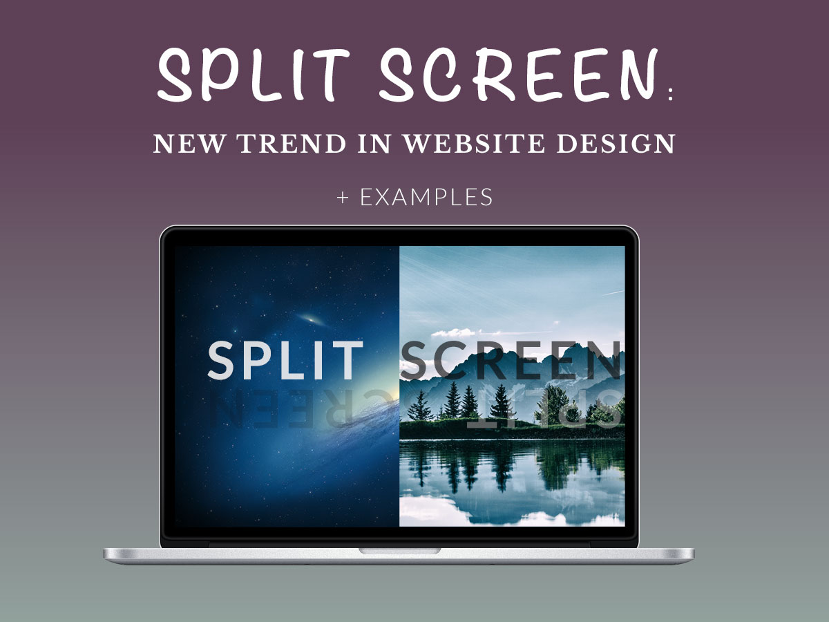
Split screen design is a new trend on the Web. It both looks good on mobile and gifts perfect user experience on the desktop. This trend is gradually evolving and developing to become even more efficient for user satisfaction.
Let’s review the peculiarities and benefits of split screen design.
What is a split screen?
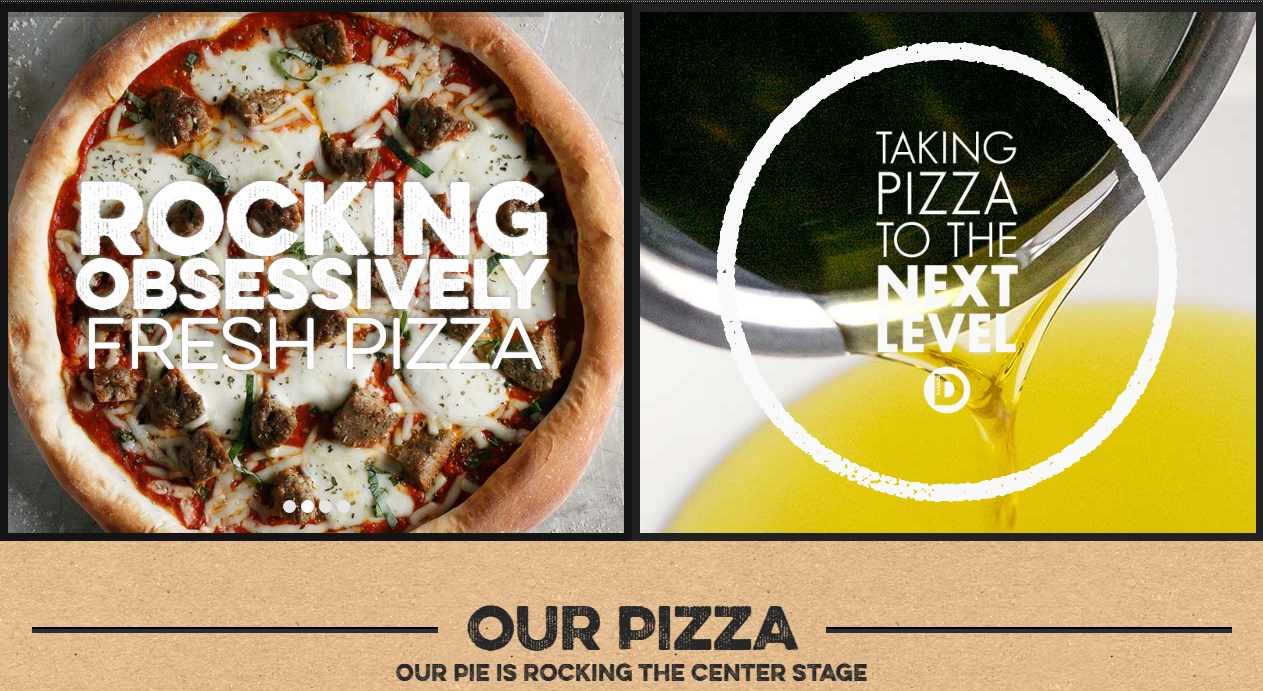
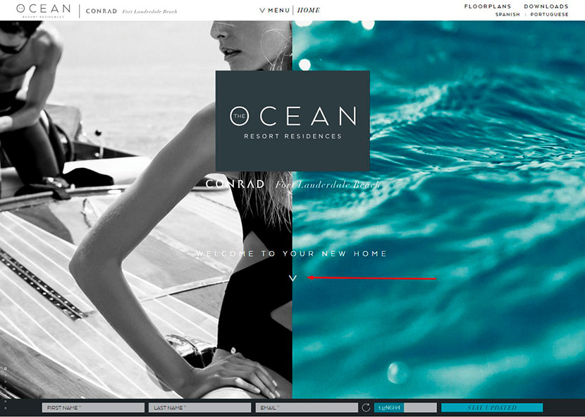
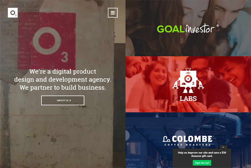
Actually, the homepage of a site consists of two pieces of the content located together and providing a user with the possibility to make a choice whether to click one or another part of the page.
Why split screens work well?
A user sees two different parts of content at once, so they can choose what content part to choose to proceed further. This creates freedom of choice and makes a user be sure they rule their personal direction themselves.
Natural curiosity makes a user examine both choices and select both paths one by one to learn what they have probably missed. This makes them stay on a website page for longer, navigate through the categories and posts, take some actions, and, as a result, increase a website’s conversion rate.
There are several reasons to use a split-screen design for your site:
- make a user believe they have an opportunity to pick any of two or more available variants;
- create a call-to-action;
- make a design which stands out from the crowd (the one which differs from lots of fullscreen hero images on homepages).
Another virtue of split screen design is that it beautifully works with responsive format and creates a consistent experience both on desktop and mobile.
Types of Split Screen Designs
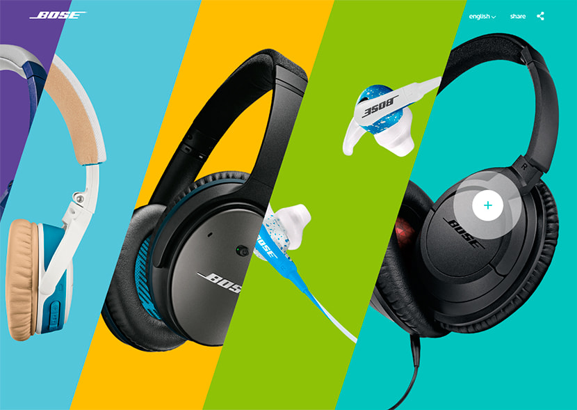
It’s not compulsory for a split screen parts to be symmetrical, they can be different in size, color and style. Sometimes there are three or more parts of such designs which work like an accordion when being clicked.
It’s possible to create a split screen located only in the header of the homepage and then hold to standard page structure with info-boxes, CTA buttons, and long scroll.
However, split screens can occupy the whole homepage area from header to footer, and this will also look great.
Multiple Areas to Click
If a standard design has at least two CTA areas per one screen, the split screen design, in its turn, has multiple areas to click and contains much more brief information on a homepage.
A split screen can include a message and an appealing image in one part and some clickable products, icons, buttons or images in the second part. See the example.
Try the split screen for your website and share the results. We will be happy to discuss. See you!
