Website design is an inconstant value. It’s the thing which should regularly evolve and be kept updated on a regular basis. Trends change, tastes change, so website design should also be changed and improved to meet the needs of modern users and keep up with the times.
There are always several design elements that should be added or removed to make the overall design better and make a website look up to date.
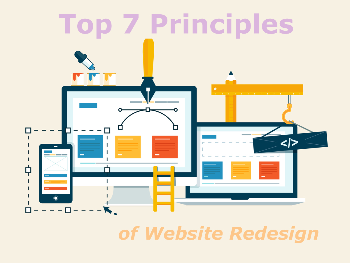
Let’s speak on a few basic rules required for creating a modern website design:
1. Build a Perfect Layout

Every cool website design starts from thorough planning of a web-page structure. This will help you observe the final results of creative process, so you will be confident as for the overall look of your website before you start the redesign.
You can create a concept of your future website’s look using Photoshop or you can just draw it by pencil, no matter what way you choose, you should have a clear idea of what you will have in the end.
2. Download or Create a Style Guide
There are a lot of style guides available on the Web, so you can choose any of them and download it for your needs, or you can create a unique one depending on your own imagination and needs.
Such guide is used to keep the information about color scheme, fonts, and other elements of your future design.
3. Use Simple Typography
Fonts are something which is responsible for an important part of your brand identity. They influence the impression of users and they define the way people perceive your website. If you select some exclusive fonts for your website, try to keep them as simple as possible.
The key aspect to pay attention at is that your fonts are easy to read and legible. Don’t use fanciful italics or too extravagant fonts, be sure your typography is clearly visible and understandable for a viewer.

4. Responsive Layouts and Images
All currently popular websites are made with mobile in mind. They easily adapt to the screens of tablets and mobile phones, ‘cause most of modern users browse websites from their handheld devices.
Make sure your new website design is fully responsive. Test it on real devices and make sure they look perfect both on desktop and mobile. Check how your design looks and operates on every device.
Utilize responsive images on your website and try to use only hi-res ones. Don’t hesitate using images which suppose interactivity, for instance, a user can click an image and be redirected to another web-page or section of the website.
5. Upload Videos
Video backgrounds or videos that play automatically once a visitor opens a website help users understand your main message, get an insight on your product or service as well as make your mission clear.
6. Create Intuitive Navigation
Of course navigation is something which makes your website accessible and easy to browse for visitors. Make your navigation intuitive and simple to help users quickly find what they are looking for.
Main menu with key items, categories in the sidebar, related posts, interactive elements, and other related elements will make every section of your website easy to access within a few clicks. Mobile versions of modern websites often use hamburger menus, drop down menus, big buttons, and more navigation peculiarities.

7. Match Your Brand
Be sure your color scheme matches your brand and makes your website recognizable for loyal customers and repeat users. Use just a few key colors for your menu, CTA buttons, titles in lightboxes, etc. Don’t overwhelm a user with color and make your design as attractive for a viewer as possible.
Conclusion:
Of course you may have your own redesign principles which either match basic ones or differ a lot. However, your new design should obviously engage your target user and your website should be simple to browse to satisfy your potential client.