When you just start your design career, you probably face a lot of versatile clients’ needs and you often hear standard phrases they use to describe the things they want to see when a project is ready. The fact is that most of the overused clichés don’t bring any exact information, so every designer would understand them as they personally want, and this is sometimes really confusing.
We’ve decided to name and discuss 10 of the most widely spread clichés that designers sometimes consider to be compulsory to follow when they hear them from customers.
1. Make It Pop
This is one of the most frequently used clichés which we often meet in blog posts, any design product descriptions, and of course in customer requests. But what does it mean? Depending on the designer’s qualification, experience and taste, they understand this encouragement differently.
Of course, if a designer wants to make a quality job, they will choose some trendy fonts, relevant images, and stylish color combinations to create a design which looks both awesome and engaging. But sometimes customers imagine this “pop” as some crazy colors, irrelevant stock photos which just look bright but don’t bring any certain message.
The task of a designer is to find a happy medium both to meet the needs of a customer and create a trendy, quality and stylish design.
2. Just Be Creative
This cliché is also that one which every designer perceives as they personally want to. Creativity is a very extensive concept which can be understood in a variety of ways. There is a number of niches, focus areas and types of projects where it’s almost impossible to be too creative.
For instance, if you make a minimal business website design PSD, you should follow plenty of specific standards which you can’t miss or avoid, and you should apply your creativity really carefully.
3. Take It To The Next Level

When a client says this cliché, they often mean they don’t like your design or they want you to make some revision. Probably your design doesn’t meet the requirements of a customer or looks like an out of date one. So the next level may mean that you should learn modern trends better and consider every customer’s suggestion.
4. Make This Design To Get Good Exposure
If you’re a newbie, some clients may use the opportunity to ask you to create a free design for them just for exposure. They say this project will be a good chance for you to show off your skills and establish yourself as a designer.
It is up to you whether to accept or decline such offer, but pay attention to some important aspects:
- Will you be able to use this project in your portfolio?
- Will a customer recommend you to his/her friends and colleagues?
- How much time will you have to spend to complete this project?
If this is one of your first projects and you have no additional propositions from any other clients, then you can agree to make it just for exposure needs and with no opportunity to earn. This will be good practice for you and a perfect step to creating a worthy portfolio.
But if you’ll have to spend a lot of time for this free project instead of working with other clients who promise to pay for your work, think twice which is better for you: whether it is more important to earn money for your job or just get some experience and create another unpaid work to use in your portfolio.
5. I’ll Send You a Fax
Sure, there are currently no designers that use a fax machine for getting suggestions from their customers. This cliché shows that your customer has just stepped out of time a bit. Even if this customer’s tastes are also outdated, it’s always your prerogative to suggest some of the best trendy solutions and explain why they are relevant for this certain project.
Find a compromise both to meet the customer’s needs and create something really worthy. Start from offering them to communicate by email and discuss all project details using some convenient modern messengers.
6. Make It Similar To My Competitor’s Website

In this case customers say something like “Create a website exactly like this” and then show you a website they want you to copy. We all know that stealing someone else’s work is a really bad and unprofessional habbit, but many designers use this strategy and even succeed.
If you just copy someone else’s color scheme, layout, buttons, graphics, and any other elements of design, this won’t work as a long term tactics. Your stolen website design won’t be unique in anything from typography to overall style.
7. Create a Large Logo
Of course it is sometimes quite possible to create a really big logo on a website, but it’s important to make sure it will look seamless and match all other design elements without distracting the overall harmony and order.
8. You’ll Complete This Project In a Couple of Days
Sometimes customers think they are qualified enough to define the exact terms a designer needs to complete a definite project. Create a list of steps that should be done to craft a certain type of design (let it be a poster, a brochure or a website) and count the time you need to complete every step. Then show this list to your customer.
A customer may agree the terms or discuss them with you, just make it in advance (before you start to work with a project).
9. I Like a Lot of Cursive Text

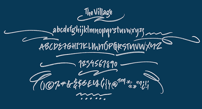
Using a lot of cursive text on websites, especially in titles and subtitles, is already out of trend. The main reason for this is that it makes a website tough to perceive and many texts are uncomfortable to read. Create two sample texts made with different fonts and let your customer just compare, let them decide which one is easier to perceive.
10. I Want a Vintage Style for My Technology Store
Retro and vintage styles look really cool for many types of website designs today. However, this style should match the niche that a website is in. Vintage will be perfect for a website of café, interior designer, magazine, coffee shop, etc. But if your client runs an online store selling modern tablets, computers, phones and household appliances, it would probably be better to create minimal modern design.
You can add just a few small vintage elements if they match the overall design, and this will likely to look outstanding and creative.
Conclusion:
There always should be a bit of critical perception when you analyze every customer’s request. If there are any suggestions you aren’t agree with, just discuss them with a customer and find a suitable solution together.


