Emotional connection with a user is something that brings trust and reliability to your website. Emotions are sometimes broad and clear, direct and understandable, and sometimes they are hidden, confusing and complicated. We will speak on how to create an emotional user interface and what to consider while creating your emotive UI.
Emotions to Consider
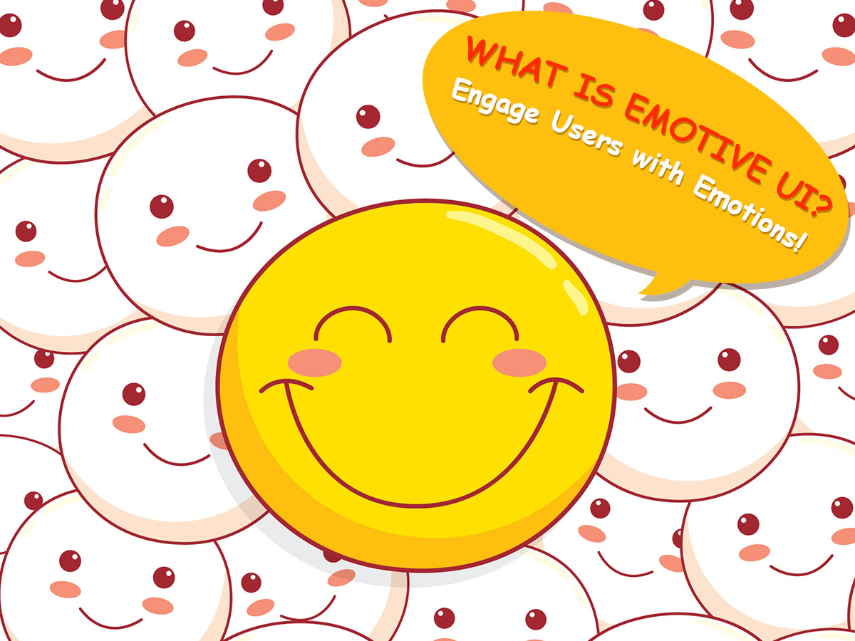
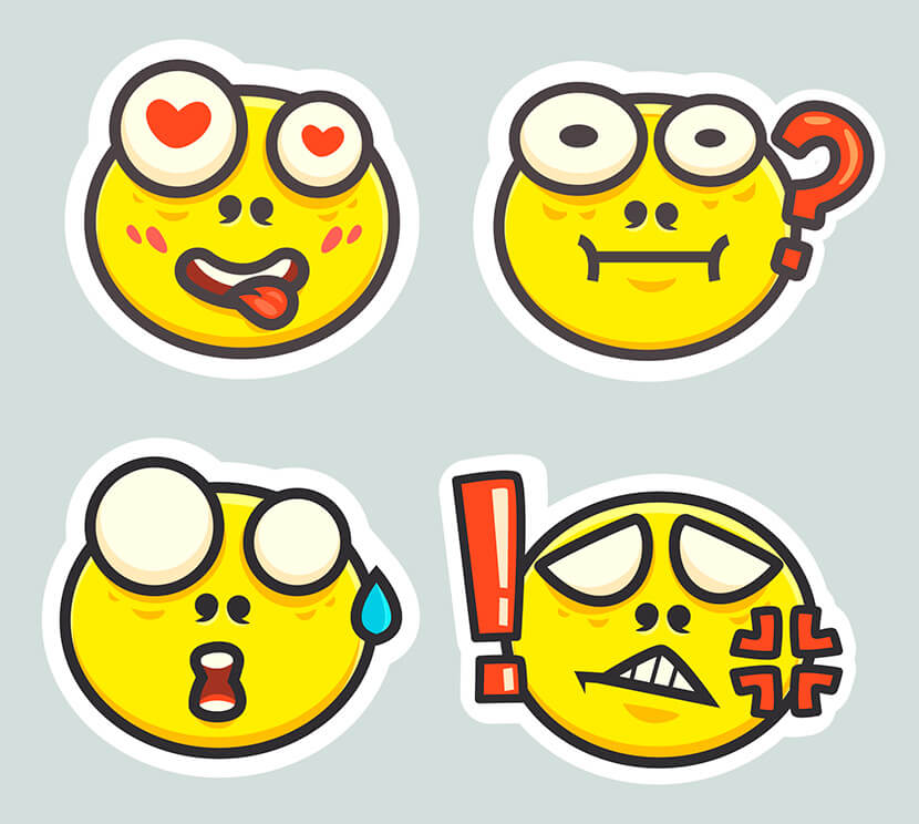
When we write emails, communicate in any messenger or social media, we use smileys to express our feelings. When communicating with your design, people also feel either joy or anger, fear, sadness, or any other emotions at a time. The task of a designer is to avoid building designs that trigger no emotions at all.
It’s obvious that a design which is tough to understand, cluttered and slow, will cause negative emotions and will make you lose a good amount of users. That means that positive emotions should prevail in your clear and intuitive design, and users shouldn’t feel any frustration when using your website or app.
Ways to Convey Emotions with Your Design
What design elements work as an emotional accelerator? We think they are:
- The language you use in your texts (style of communication, typefaces);
- Colors and color schemes;
- Images and photos (faces, products, materials, human beings, animals, etc.).
Modern psychologists state that positive emotions give a broader spectrum of possible actions than negative ones. A positive experience leads to positive associations. This means users will want to discover your website more, learn more of a certain product or service represented on the website, browse the pages for longer and make a decision to buy a product, subscribe for the newsletter or even become a loyal customer. All of this is, of course, the right step to improving a website’s conversion and increasing trust.
Language
When you speak to a customer through your design, state that “we” is more important than “me”. Show people everything is done specially for their comfort, their ambitions, and their desires. Say “Join Us Now” instead of “Create an Account”, “Learn More” instead of “More”, “See How it Works” instead of “It Works as Follows” when calling a user to action. Customer satisfaction is a priority and this should be reflected in the design.
Color
Color and imagery is the way to express the emotions and get users to make the desired actions. So let’s speak of the main colors used in modern design and the emotions they evoke.
- Orange – playful, energetic, cheap
- Yellow – happy, friendly (sometimes warning)
- Green – natural, stable, prosperous
- Blue – serene, trustworthy, inviting
- Purple – luxurious, mysterious, romantic
- Red – passionate, aggressive, important
If you use the colors correctly, you can manipulate the emotions up to your needs and get the required result very easily.
Imagery
If you use photos and images, then there is a wide spectrum of emotions they can cause, and most of them should be positive ones like:
- attention and surprise;
- trust and belief;
- joy and pleasure;
- happiness and energy;
and more.
The key fact to remember is that emotions are personal, and different people react to various stimuli differently. However, happy faces on photos, friendly language, and warm colors are more likely to convey positive emotions of a large number of users.
Conclusion:
Designing on the emotional level is not new and pretty predictable, but many designers often neglect the essentiality to connect the UI with emotions to attract more users and make them stay for longer. So if you treat this aspect right, you are sure to succeed.

