Design is something intended for catching the eye of a viewer and making them say “Wow!” It creates the visual appeal of web-pages, banners, printed products like flyers, cards, packages, etс.
This is why when you work upon the appearance of a website or, for instance, create a brand-book or corporate identity, your task is to make the design as appealing as possible.
When it comes to building a web-page, your design should be engaging and catchy enough to make users stay for longer. The task here is to trigger emotions because only emotions are the key to engagement.
Humor as a Part of User Engagement
‘Knock, Knock!
Who’s there?
Ken
Ken who?
Ken I come in? It’s cold out here.’
Let’s see you’ve got bad mood today, something went wrong right in the morning: the neighboring dog barked at you, the motor of your car refused to start, and rain has spoiled your new suit.
You’re back at home and you open a certain website to read the news or you browse a web store to look for a pair of shoes. I guess, your mood is going to be a bit better if you just smile when suddenly notice a short joke in the caption of a slider.
Humor helps to relax and remember that a site is crafted by humans for humans. Jokes make welcome texts look like they are alive and not computer generated.
‘- What does a cloud wear under his raincoat?
– Thunderwear!’
However, when incorporating humor into the design, it’s important not to appear silly, so good taste in humor is compulsory. There is no need to make people guffaw, smile will be enough. So use all of your wit and keep it worthy.
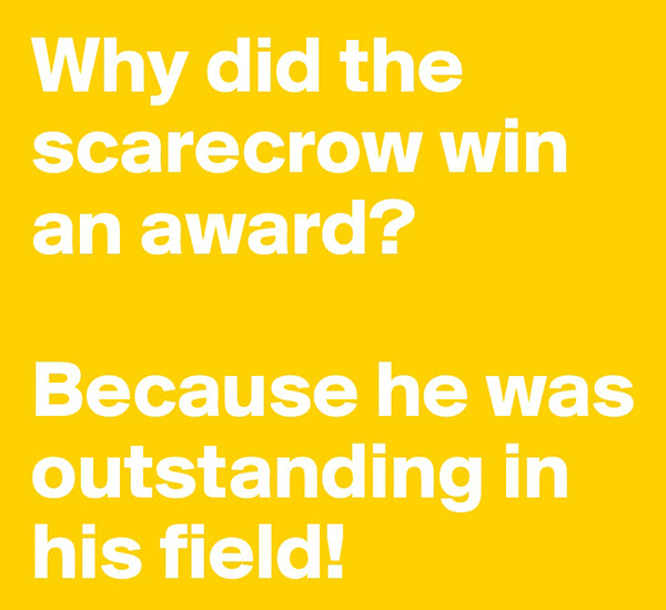
What types of jokes it would be better to use?
1. puns or word-play;
2. metaphors and figurative meaning;
3. original approach;
4. jokes that are easy to understand for your target audience.
Word-play like “patients – patience”, “dear –deer”, “bear (a beverage) – bear (an animal)”, “seafood – see food”, and similar puns in your jokes are going to show you’re witty and you like to make people smile – benevolent humor is the best way to engage folks.
“I’m on a seafood diet. Every time I see food, I eat it!”
“Why is a doctor always calm? He has got a lot of patients.”
Make your audience have fun to keep them interested when examining your piece of design or walking around the pages of your website.
Images and Animations for Fun
One of the most boring and frustrating things in life is waiting. This is why we all tend to visit only fastest websites not to wait until it loads, we hate empty coming soon pages which say nothing about the time when the site will be live, and we hate to look for information for too long, especially when we come across 404 error pages when searching for what we need on the Web.
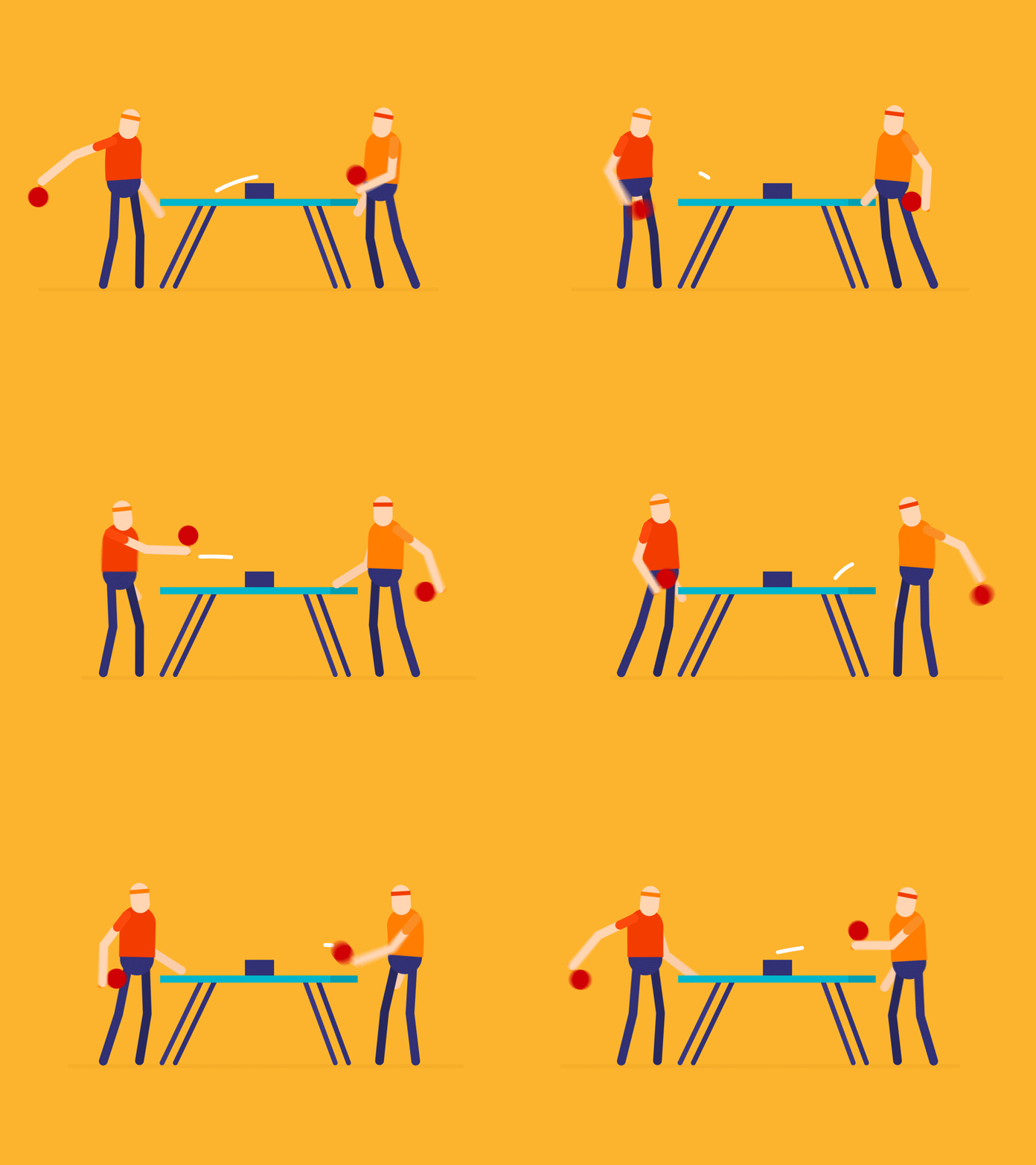
So when creating a website design it would be great to foresee something fun for users while they are waiting until some heavy content loads or when they land on an Under Construction page of your website before it is ready.
Funny gif animations and interesting images come in handy here. You can also add some interactivity and create a small game like Google’s T-Rex Runner which appears in Google Chrome when there is no internet connection.
Final Thoughts:
Be reasonable. When using humor for your web design or any other design you create, it’s important not to go overboard. Too much of anything is always bad, so it’s better to keep it balanced when it comes to jokes and fun no matter what purpose of website it is.
So I hope this small advice was helpful,
Yours,
Melany H.
