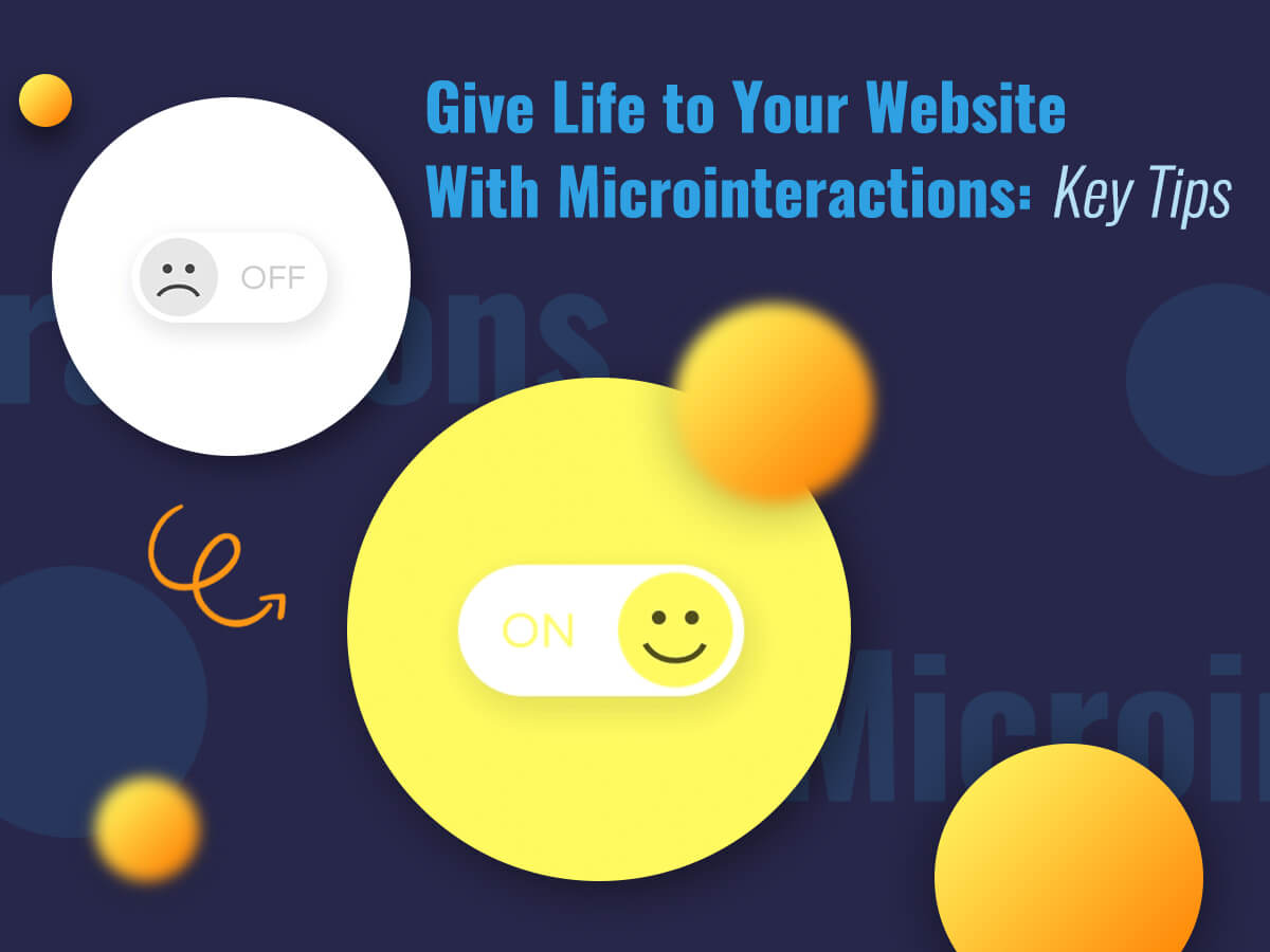
It’s impossible to imagine a modern website without any microinteractions. Some of them create a kind of fun, others are used to help people understand certain functions or take actions, and actually, microinteractions improve user experience and engage visitors which become your potential customers.
Microinteractions allow to surprise or entertain users, so your website or app will never be boring for them. If you’ve recently launched a website and you don’t use microinteractions, it’s time to start.
The Purpose and Examples of Microinteractions

So let’s define the main functions and aims of microinteractions. What are they? It would be quite right to define them as small actions which wrap up a certain task. As a result they have to:
- Provide a definite feedback or the result of an action
- Provide a guidance for a user
- Accomplish a single task (for instance when a user likes a post)
- Manipulate a setting
- Prevent an error of a user
- Create simple visual cues for messages
- Encourage users to share, like and comment posts
- Enhance website navigation
So what microinteractions you usually experience or execute? They usually are as follows:
- A vibration of your muted telephone when you get a notification
- Autocomplete function when you type
- The pull-to-refresh function in Twitter app
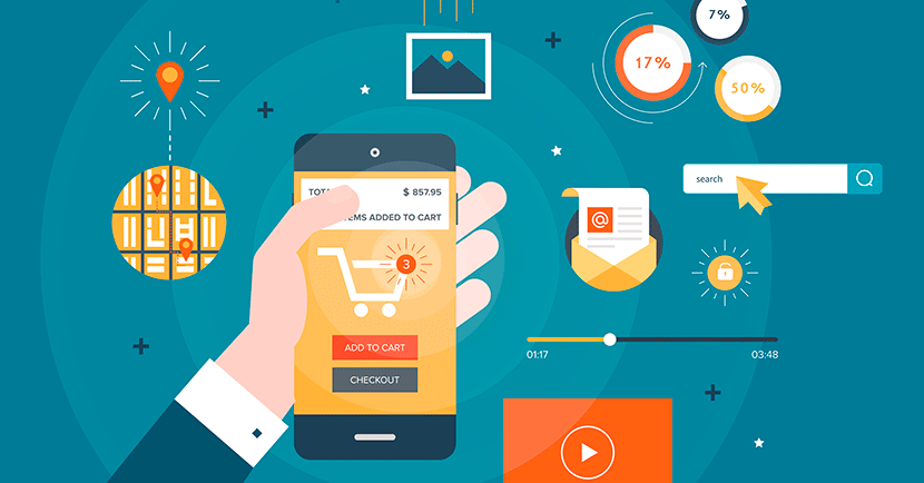
- Animation effect when a product is added to the cart in online store
- Swiping to the different sides in apps
When you use microinteractions, note that user experience should be a priority. If you use animations they should be relevant and subtle, if you use hover effects, they shouldn’t distract a user’s attention from the main action they should perform.
Tips for Correct Use of Microinteractions

Please consider your main aim before you add microinteractions to your website. Realize what you want to achieve and what results you want to get.
There are some tips to follow when you decide to add microinteractions to your website or app:
1. Make them instant. If an action is instantly followed by microinteraction then they will surely be associated with each other. For instance if you suppose that clicking a button should be followed by animation, don’t make this animation appear in more than 0.1 seconds after the click.
2. Make it simple. Microinteractions shouldn’t be confusing for a user. If they are easy to recognize and quite predictable this wouldn’t ruin the positive user experience.
3. Be minimalist. When it comes to color schemes and typefaces, it’s better to make them as simple and pleasant to the eye as possible, no spare details and irritating tones.
4. Don’t overwhelm a user. Any animations and effects shouldn’t be disturbing for a user. Make them as subtle as possible.
5. Consider the personalization. Try to predict the natural user’s behavior in a certain situation, this will help to prevent possible user errors while interacting with your website or app.
Conclusion:
Microinteractions always have an effect on your website design or your application. And of course they allow to improve user experience for your visitors. Any links, buttons, hover actions can be interactive and bring fun and amusement to a user.


