Easy to perceive content is one of the key aspects of quality design. It goes without saying that every modern website design should be responsive, and there are some content changes that should be made to help it look awesome on the small mobile screens as well as provide users with great UX.
In this post we will speak on how to make the content look and work seamlessly on mobile devices and what to pay attention at to get users easily interact with design on the small screens of their devices when they enter and browse your website. So let’s start.
1. One Element Per Screen
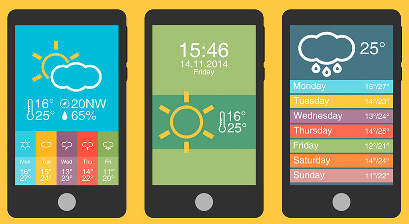
Be sure not to stuff a lot of information into one screen not to overwhelm a user. One content element (imagery, text block or else) per screen is a great solution for mobile users used to perform multiple tasks at the same time. So when a user talks to someone in Viber while sitting in the cinema, they can open a browser to visit your website and easily perceive any information displayed on the screen.
When your content is simple and understandable, you engage more target users using mobile devices to attend your web-page.
2. Make Navigation a Priority
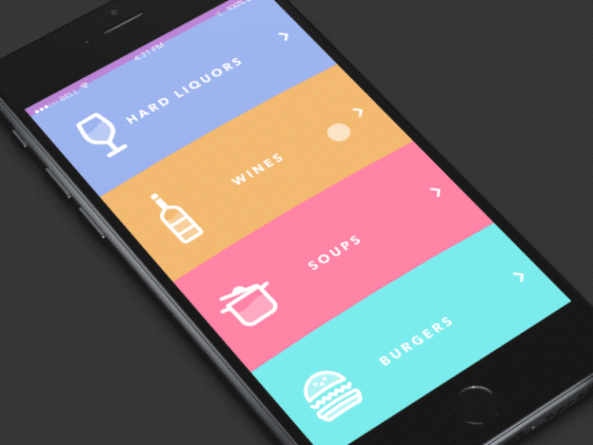
When you design a certain page or element, you know what a user should do on that certain page when they open it. So your task is to make it easy for a user to perform an intended action. All elements and pages should be easy to find and accessible, and this simplicity depends on the ease of navigation.
While a multi-level drop-down menu works well for your desktop website version, this wouldn’t probably be a good variant for a mobile display. Your mobile navigation should be clear and simple enough to make a visitor find anything they want within a few seconds.
To determine the key navigation elements, go to your mobile user analytics and see what pages of your website are visited by your users the most. If you use the hamburger menu, include all the key pages into it. Users will start browsing from the main navigation elements and then reach out to other information they are looking for.
3. SEO-Friendliness in Mind

Don’t neglect the importance of creating quality content. When it comes to mobile version of your website, make sure that every element of content, every image and text block is easy to index and simple to search for.
Make an accessible mobile site which is lightweight and easy to use. Leave only the most important elements and get rid of all the cluttering ones. Just don’t forget to make every step with SEO in mind not to be penalized by algorithms.
4. Big Letters in Texts
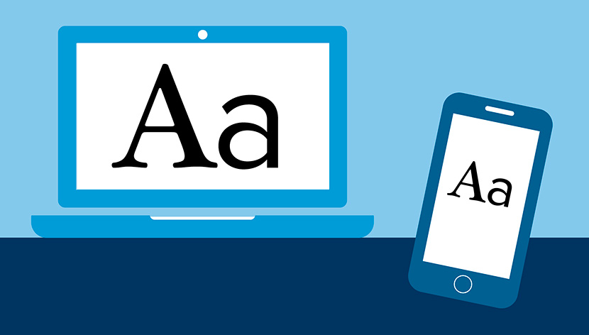
Although modern phones are trending towards large sizes, some devices still have small screens instead. No matter the display size, the content should stay readable and legible. Choose a size allowing up to 40 characters per line which is half of what is recommended for desktop displays.
Add a little space to text both between lines and in the margins, and help users better interact with the words. Select a readable font, consider mobile proportions and scale, and make everything possible to perfectly adapt your typeface for mobile users.
5. Informative Text in Buttons and Elements

The text inside the buttons makes users correctly take a certain action. It also adds personality to the overall design. Except for legibility, this text should be meaningful and clear, this is the direct instruction for a user on what to do to reach certain results. It’s a well-known fact that mobile buttons should be much bigger than desktop ones and this rule is still essential today.
6. Remove Visual Effects
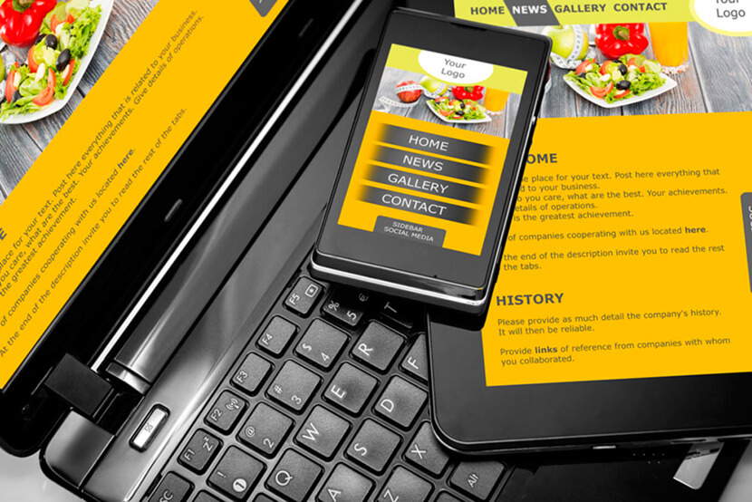
Parallax scrolling, hover effects and different animations are pretty popular on most websites today. However, they are quite unnecessary and even harmful for mobile versions. Make your mobile design load and work quickly and remove any heavy effects from your mobile website.
Your every element should be easy to tap, and a website should be fast enough not to make a user wait for ages until any certain action takes place.
7. Scalability is Important
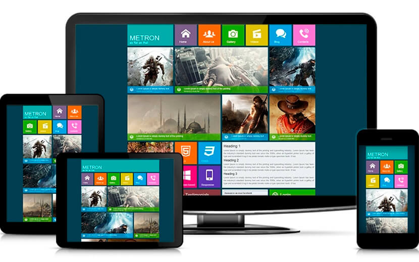
The content for mobile should be scalable and easy to read. Most of the times we notice that the lightboxes that are located horizontally across the screen in desktop, are located vertically on mobile screens, tiny desktop buttons are bigger on mobile screens, mobile photos are square and headings are big, navigation menu is located differently – all of this is about responsive design.
So the task of a designer is to make the responsiveness as comfortable for users as possible.
Conclusion
So if you create websites for desktop and mobile devices, make sure you make everything right when it comes to responsive design and pleasant mobile UX. Just a little better content adaptation will help your users easier interact with the design.
