Modern website design trends bring us a lot of new layout ideas that both change the look of your site and create a special mood. The appearance of your website homepage can be fun to look at, engaging, entertaining, spectacular and original. Anyway, it should capture attention and convey the emotions of a user.
If the key task of any website owner is to stand out from the crowd, I should say, the following examples of web-page design are going to come in handy here. These layouts are going to help your homepage look uncommon, attractive and special.
Let’s review the best layout variants for a website that wants to capture the overall attention of its target users.
1. Split Screen
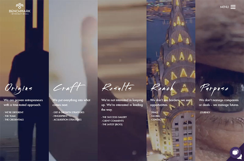
We’ve recently devoted a complete post to this new web design trend called the split screen. The main purpose of this trend is providing a user with a choice between a few different pieces of information available in several panels visible on the screen. A user can decide on what story to learn first, so he/she has a freedom of choice when hovering over a definite panel to open and see what it contains.
The screen can be divided into 2, 3 or more parts and each one can include unique information and featured image which speaks of a definite event, product, service, or anything else. A few different stories are available on a single screen simultaneously, the example above greatly demonstrates this popular design style on a website’s homepage.
2. Card Design
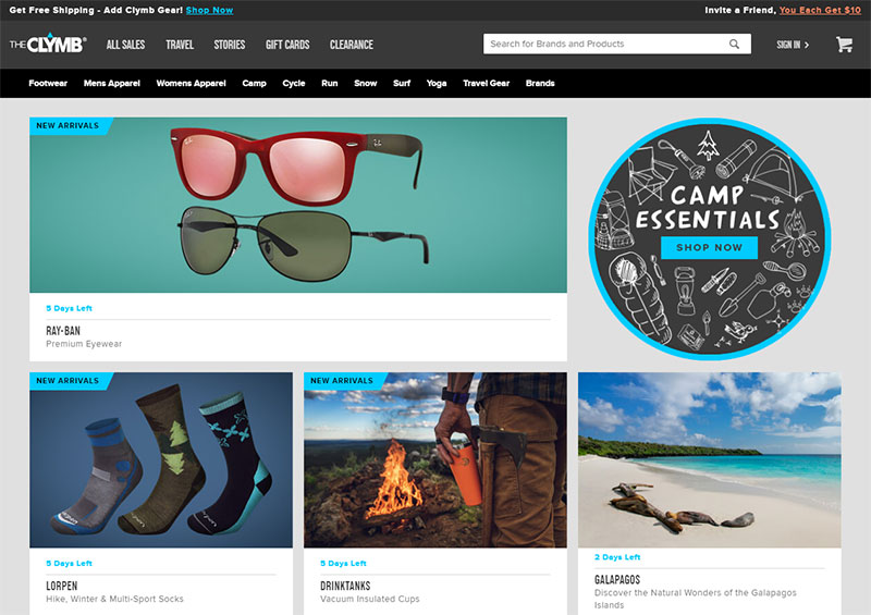
Card design still stays popular and recognized among website owners from bloggers to those who have a business or corporate web-pages. The card is mostly associated with the Pinterest style which is also called masonry one and supposes that rectangular modules with different height are placed on a single page.
Every card should include a short text and a featured photo that displays the essence of the message. Each module can be clickable and lead a user to a page with a complete article. Except for masonry, there are many more similar types of displaying content like grid, packery, and some others.
The original approach to such design can create an appeal for a user. For instance, modules can be displayed as a deck of cards on a table, pieces of a puzzle, etc.
3. Old School
Old school style always causes nostalgic memories and a kind of aesthetic joy brought by the moments that people recollect in their minds. Memories are individual for every person but you can use the attributes that are sure going to encourage people to remember something pleasant and smile to themselves.
Some music tracks, paintings, artists, actors’ portraits, movies of the past years and any old school pieces of art can cause this nostalgia you need to convey positive emotions of your users and make them stay on your website for longer.
Depending on the purpose of your website, you can either use some old school elements or create a completely old-school-style design, for instance, a vintage or retro-styled one. Use the symbols, color schemes, shapes and elements relevant to a certain historical period and enjoy the results.
4. Uber Minimalism
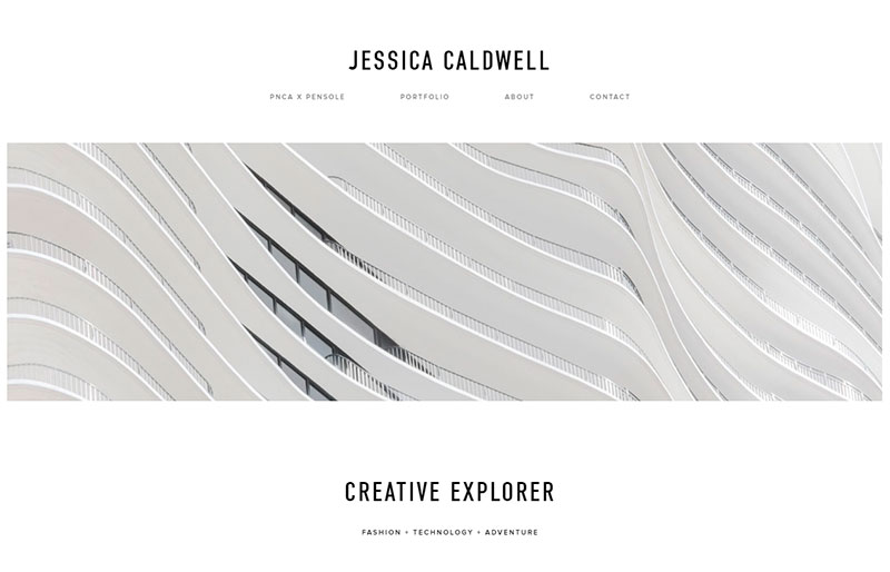
The utmost minimalism sometimes makes a web-page look very unique and uncommon in comparison with most websites out there on the Web. Sometimes a homepage can include just a one-colored logo that speaks enough of the company itself.
The example you see above includes an abstract whole-colored static image in the header, and just when scrolling down, a user can learn more of an author and her works. Minimalism doesn’t distract your users’ attention from your main content ‘cause there are no bright colors or complicated elements. So if you’d like to create a head-turning portfolio, uber minimalism will be quite appropriate style.
5. Asymmetry
Asymmetry is an absence of symmetry that creates specific harmony and original look of the design. This is a natural phenomenon because everything we observe around us is asymmetrical. Wings of a butterfly, testa of a snail, shell of a turtle, even a human’s face is not symmetrical.
Asymmetry in web design can be applied differently; however, it is often used to bring a sense of confusion and chaos as well as underline motion or action. The bigger part of a screen dominates over a smaller one to show the more important part of content which requires a lot of users’ attention.
6. Typography Focus
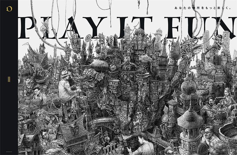
Typography in web design is considered to be a technique of arranging type. Choosing the right typefaces is the task that defines how successfully a website will be perceived by users.
Legibility is everything either when you use fonts just for reproducing information as a part of the content focused design or when you focus overall user’s attention on huge typography capturing a lot of space on your homepage. Please see the example above, this Japanese website’s homepage is crafted as an over-crowded city with multiple symbols, buildings and people.
7. Fullscreen Image
Top to bottom and left to right fullscreen high-res images create realistic and impressive look no matter what you want to display. Such background photos are called hero images, and this has been a popular trend for the last several years.
Understanding the color contrast is important here if you want your website title, logo and menu to be perfectly visible. So the darker colors of the fullscreen images should suppose that you use light-colored typography for your title and other texts on the homepage. The same is with the light background images which should be in contrast with darker fonts.
Please read more of the hero images in our detailed guide.
8. Original Approach
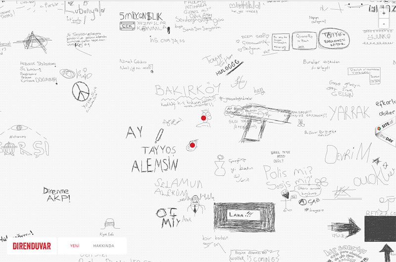
Diverging from the standards is sometimes tough when you need to stick to the rules of accessibility for a user. However, the uncommon approach is a great choice for those who want to impress and astound not following any rules at all.
The example you see above is a Turkish website which is a really unique variant of the layout made as a hand-drawn map. Here you can click any element to enlarge it, move the map on the screen with a cursor and look for any required place just as well as you make it using a regular map.
This is a great example of an uncommon approach to a website homepage design.
Conclusion:
Creating a great layout is just the first step on the way to building a competitive website in your niche. However, this is an integral part of website creation as well as the way you present your content, language you prefer to communicate with your users, navigation, usability, and many more factors. Be original to be engaging.