Before Gutenberg becomes a default WordPress editor, we are using the classic one for our post creation and we are quite satisfied with most of its options. I’m Melany – a regular WordPress user and writer. I’ve been blogging for a couple of years and I’ve got some precious experience to share with you.
As I’ve been using WordPress for a long period, I’ve managed to admit some of the most impactful changes made to the classic visual editor in every WP update.
Today I’d like to remember and review a few shifts in WP visual editor that influenced my own blogging experience and made me create new habits while adding posts into the dashboard. Let this be a nostalgic post and a kind of “summing-up” before I start using only Gutenberg for writing my new posts. So, let’s see.
What were the changes?
I think there is no need to unveil pallid statistics or name WP versions which made one or another shift appear – all details are possible to find at WordPress.org. That being said, I’d like to revise the following things:
Unlink Button
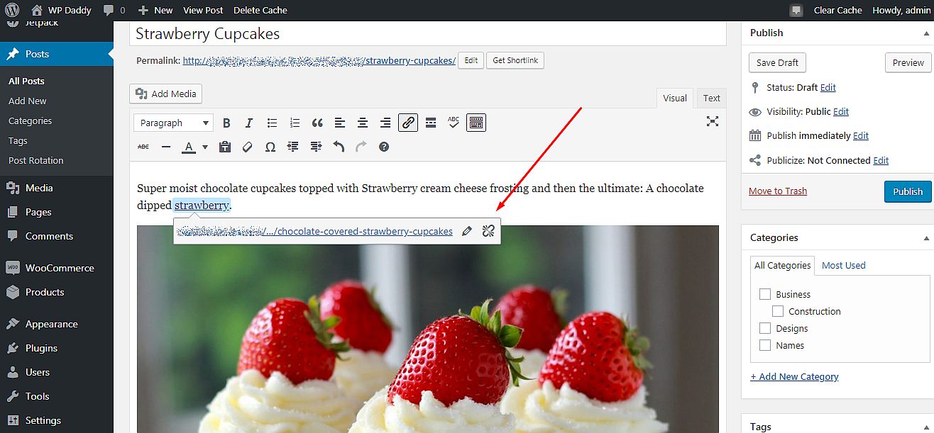
The unlink button was removed from the main editor’s toolbar more than a year ago. Oh my, it was unexpected for me to find out it was absent, however, it took a few seconds to find out it is now available as an option when you click any hyperlink.
Inserting a Link
Another vexatious change personally for me was that inserting a link now requires some additional steps.
Earlier it was possible to:
- highlight a word or a phrase I want to be linked ->
- -> click the Insert/edit link option in the main toolbar ->
- -> and a Link options window was instantly open.
So after that I could insert the link and manage its options at once.
Now I should:
- highlight a word ->
- -> click the Insert/edit link option ->
- -> insert a link ->
- -> and click the Apply icon if I want my link to be open in the same tab.
![]()
But if I want a link to be open in a new tab I should:
- highlight a word ->
- -> click the Insert/edit link option ->
- -> insert a link (or click the Link options gear at once) ->
- -> and a window with the Link options will be open.
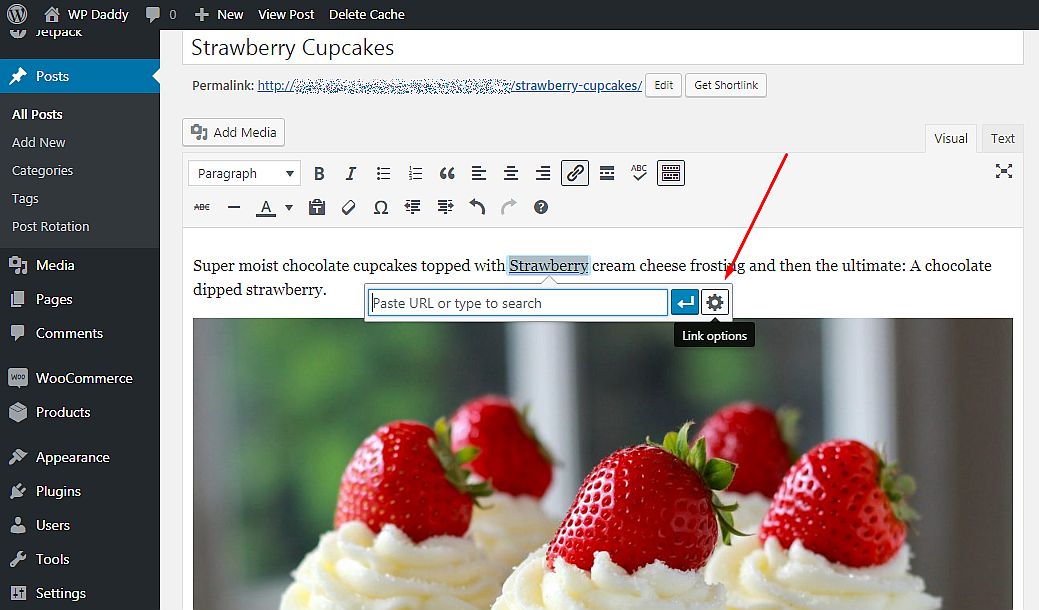
Only now I can edit the link, click the ‘Open link in a new tab” checkbox, link a piece of text to existing content, and manage other options.
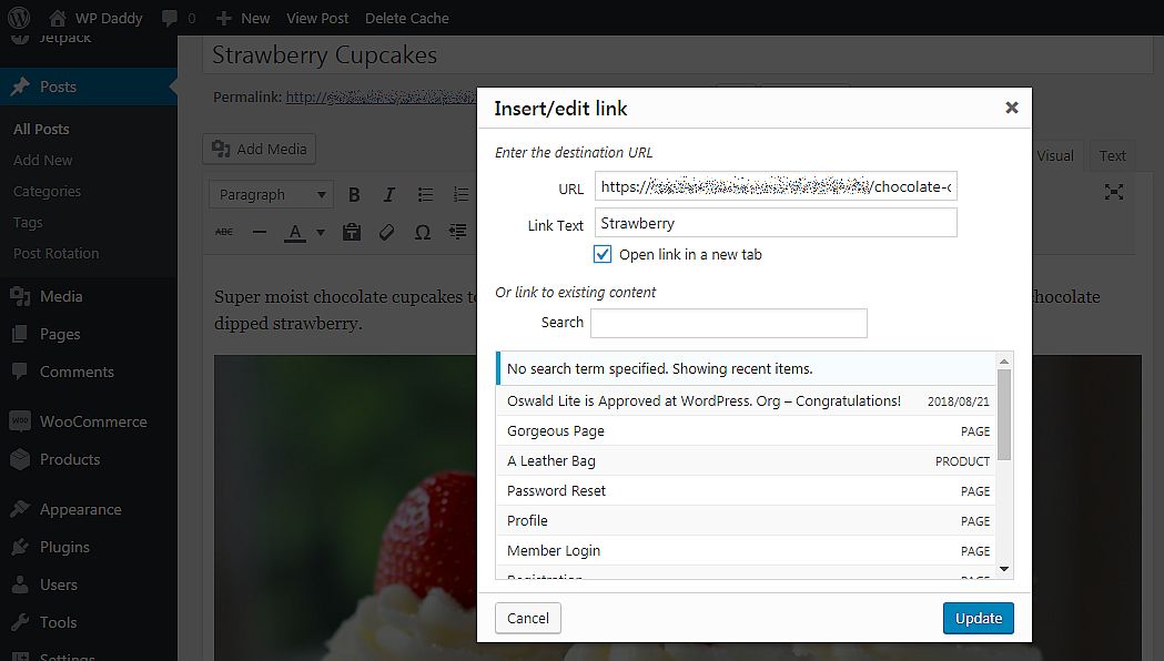
I guess editing a link now requires more steps than it was earlier… Is it convenient for you? For me, the older variant was better.
Justify Text
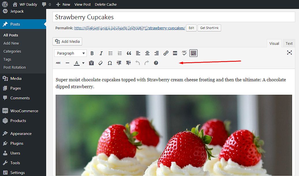
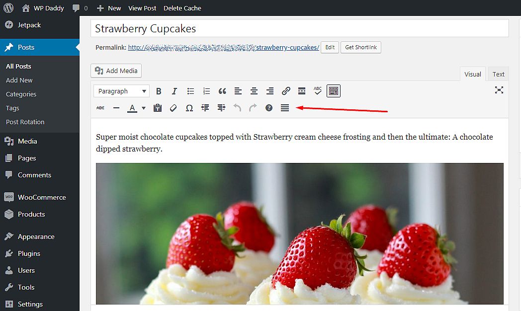
No, I won’t mention the underline button because I’ve never used it, actually. However, sometimes a Justify text button, which is missing in the current version, is really required. Of course, it is possible to add it with a plugin, but a newbie will need some time to learn this fact.
So I use a plugin and here is the button appeared.
Final Thoughts:
Well, so far I have nothing more to say because I am quite satisfied with WordPress functionality and a visual editor in particular. Please write in comments what else do you or don’t you like in the classic visual editor. Let’s discuss!
