When you run a blog you obviously strive to get as many subscribers as possible. However, you should show your subscribers they are free in their choice either to join your email list or not. Moreover, they are quite free to unsubscribe from your newsletters anytime they wish.
When creating the unsubscribe page you should also create a positive mood and show your friendly attitude to your user despite their decision to unsubscribe and leave your community or website forever.
Your users should see they are always welcome if they resolve to come back. You should also prove your user you are a bit upset they leave and you’ll be happy to see them back again.
That being said let’s review some of the best unsubscribe techniques you can feel free to use for your project.
1. Don’t Hide the Button
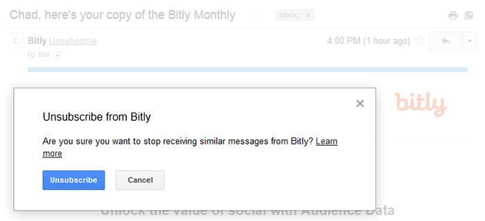
Marketers shouldn’t neglect thinking over the unsubscribe process because it sometimes can help re-win your subscriber’s heart and make them change their decision to hit the unsubscribe button. Even if they don’t change their mind, you’ll create a positive impression of your brand.
Most blog owners hide the unsubscribe button in the very bottom of the page and use a tiny font for it. There’s no need to hide unsubscribe link on the page when the user has already made up their mind to refuse from receiving your newsletters.
Make your unsubscribe button clearly visible not to cause any frustration and not to make your target users mark your messages as spam.
2. Make it One-Click
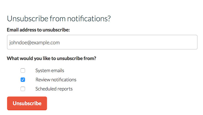
Your unsubscribe process should be as easy as a subscription. The user should be able to apply for being removed from your email list with one click.
Only the one-step process won’t be annoying for a user, so don’t make them log in again to check the options they don’t want to receive newsletters for, one clearly visible button will be enough.
3. Ask for Feedback or the Reason for Unsubscribing
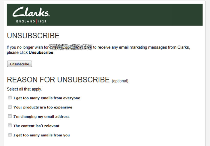
Another good technique of unsubscribing is to ask a user to choose the right variant from several options (the list of unsubscribing reasons). This will help you find out the most common reason behind the unsubscribing.
Just create an easy-to-fill-out feedback form with a few variants on why your subscriber isn’t interested in receiving your email newsletters anymore. A user will select the most appropriate variant and click the Submit button.
Their feedback will help you find out what their issue is and learn what you should improve to prevent further multiple unsubscribing decisions.
4. Email Frequency as an Option
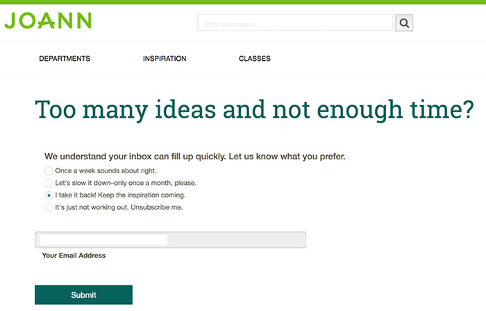
Sometimes people unsubscribe because they are tired of receiving your emails too often. If you send your newsletters daily to make them more noticeable among other mail and notify your users on every update, they can sometimes be too irritating.
Let a user select the frequency of emails when subscribing. The same option should be available when a subscriber wants to remove their email from your recipients’ list. Probably they will just change the frequency of emails instead of completely refusing from your newsletters.
5. Offer the Alternative

When a user decides to unsubscribe from your emails recipients list probably they don’t want to receive them to that certain email, but that doesn’t mean they will be set against engaging with your blog via some other ways.
If you’ve got a personal page in social media like Facebook or Twitter, offer your subscribers to start following you there. This will be the alternative which will both help you not to lose your subscribers and allow them to feel free in their choice to remove their email from your mailing list.
Conclusion:
Your unsubscribing process should be a one-step and easy one; it shouldn’t irritate your user or take too much time. No need to send follow-up or confirmation emails, hide the Unsubscribe button or use any other tricks to make your users stay. Make them feel free to choose whether to stay and be friendly and positive to leave a good impression and get a chance that your subscriber is going to come back.
